
ACC100:
Structure and Styles
Topic Overview
The goal of our courses are to deliver content and educate the students. The style and structure of our courses should aid and support that goal rather thad detract from it. A good design is one that users do not notice because if they notice it, it typically is due to frustration. The objective of this topic is to inform you of how structure and page stylings can effect the accessibility of a web page. You will learn the things that you can do to have the page visually organized content properly while allowing for proper navigation through the page using assistive technologies. You will also learn how the visual structure can help or hurt students in terms of time spent on a page trying to accomplish their current task weather that is to get information or to navigate to another area of your course.
By the end of this topic, you should know:
- What elements effect the read order of assistive technologies.
- How visual elements and structor effect cognition.
- Why it is important to supporting content and how simplicity is bliss.
Frames
Frames are made from different web pages brought together into one browser. Most users do not think of it as seperate sites because they see a single site. Developers, of course, realize that it is seperate sited being displayed together. Screen readers on the other hand, do treat frames as seperate pages. Many screen readers at this point can handle frames fairly well and many provide a user with a frames mode. For the screen reader to utilize frames mode properly and for a user to be aware of which frame they are in, there is additional coding that needs to be put into place such as proper document type, frame titles, as well as providing noframe content, which essentially makes you create a seperate instance of the web site not using frames. Since this is often not part of the typical web design process, it is often missed. Even given the frames are properly coded, frames can cause cognitive and usability issues. we do not use frames in our courses so I am not going to go into the ways to properly code frames for an accessible design. If you would like more information on creating accessible frames, you can find it here: Creating Accessible Frames
Layout Tables
Table layouts can become a challenge for users of a screen reader. Tables are read in the same way as a book by default (unless coded to be read otherwise). Because of this, the web developer must code the table properly to have the cells (page content) read by a screen reader in the intended order and the users are restricted to only receiving the page information the way that the web developer has determined as the best way. Often times, the web developer will not code the content to be read in any particular way as it is not something that they are concerned about. If the developer has coded the page content to be received in a specific way, there is generally a distinct reason for it. The way a web developer chooses content to be received may not always be the best way for the users. It is better practice to allow the user the most control over how they receive content in most cases. Exceptions to this should only occur if there is a good reason or a specific purpose.
CSS Layout
Styling a page and the layout can be achieved through the use of CSS and is a more accessible option. CSS should be used for page styling and layout when possible. Table layouts can become a challenge for users of a screen reader by limit the way that they can receive the information on a page. The page should be coded the way that the content should be received to users of a screen reader. The visual reception of the page content can then be styled using CSS.
When separating body content, using the paragraph <p> tag as opposed to the break <br /> tag is preferred so that screen readers and assistive technologies can differentiate between the content. The <br /> tag should be used to visually separate related content (such as a list of related items), while <p> tags should be used to separate paragraphs.
Text alignment is an important styling element when considering the purpose. Aligning text to the left will promote cognition and comprehension the most for content in paragraph form.
General Navigation Info
A page is often structured by having the navigation an the top or left of a page. Because a screen reader reads through a web page much like we read through the page of a book, it will read the navigation links before ever reaching the content. This may be something that the user wants however, if the user is reading through a lesson and moves to the next page, they do not want to have to go through the navigation all over again before continuing onto the lesson. It creates a cognition break as well as simply consumes more of the student's time that can be avoided by including a "skip to content" link.
Skip To Content
The skip to content link should be titles just as it is written and should anchor to the start of the page content area. This link should be the first link that the user will reach when using the Tab key to navigate the page. This can be done by placing it as the first item in the HTML body and using CSS styling to hide it until it has keyboard focus by tabing onto it. This means that a sighted user using the mouse to navigate will not ever know it is there. Another way this can be done it to give it a tab index of 1 so that regardless of where it appears in the HTML body, it will be the first link a user will reach when using keyboard navigation.
Linear Code
Aside from the tab index rules, assistive technology will access a page in a linear fashion. You should think about what order you want users to receive information and be sure to structure your HTML code in that order. This order may be fundamentally different for sighted users and users accessing your page with assistive technologies. As an example, like before we mentioned that it may be more efficient to have the user reach content before they reach the navigation but visually, we want to have the navigation appear on the top or left of the content. One way to do this is to create a skip to content link as we covered. another way would be how we write the HTML code. You could write the main content into the code first and then the code for the navigation menu and links after the main content and then place those menus at the top or left of the page through the use of CSS styling. This will ensure that the page looks as expected for sighted users but assistive technologies read the page in the most efficient way possible.
An argument against this is that the user now needs to navigate through all of the content before being able to use any of the navigation. If you use the proper tab index convention, the user can still navigate straight to the navigation links by using the Tab key if they need to. Most screen readers have the ability to list all links on a page as shown in figure x below. Screen reader users often will use this function for the navigation links rather than links within content. Using the tab index properly will ensure that the navigation links show up first in this list and in the proper order. When these methods are used, you do not detract from the navigation when placing the main content in the code first before any code for the navigation.
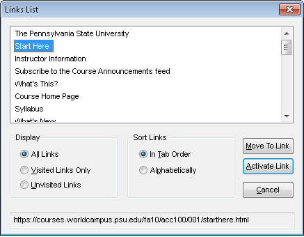
Figure x.
Links
Title Attribute
(covered in HTML Section)
Name/Description (Context)
Links should give a title but the name of the link should also help convey the context of the link with regards to the materials that refers to or surrounds it. Screen readers can read links as a list of links on the page, disregarding the content that surrounds them. For this reason, the link’s name should help give a description or context to what the user will be linking to.
Link Colors
The colors of links across the web predominantly look the same way and unless something different is specified, browsers render them all in the same conventions. They have a specific blue color when they have not been visited and they turn a darker purple color once you have visited them. The links are also underlined for a non color visual representation. One argument I will not make here is that these colors are the best colors to use. There is however the argument that because it is the typical experience users encounter across the web, it is in effect the convention the user expects before ever visiting your page. Experience is a big part of usability and the best practices that should be used. The user should have information presented to them as they would expect to receive it, unless there was a compelling reason to change an element.
One example of a compelling reason to use a different color, in spite of what a user would expect, could be in relation to other color elements on the page. If your background color is a similar blue as the color typically used for un-visited links, you would want to specify a color that has better contrast from both the background color and the text color you have chosen so that the link visibly stands out.
New/Pop-up Windows
Avoid links opening in a new window when it is not necessary. Opening links in a new window can become confusing for users of a screen reader, users with cognitive impairments such as ADHD, and users with small screen resolutions on devices like netbooks, Internet tablets, or smart phones.
If you need to use a new window, always identify that a link will be opening in a new window so that the user is aware of their placement once the new window opens. This is important because the new window will need to be closed to get back to the previous content rather than using the back or previous functions.
If JavaScript is being used to open content in a new window, linking back to content should be provided. This would be very important for the user if they did not understand that the link had opened content in a new window. This could happen if a sceen reader did not tell the user that a new window was opening, or if the user was not paying attention when the screen reader did mention it. It could also be helpful for user's who have JavaScript disabled and the content ends up opening in the same window. Typically when we open a link in a new window, we do not add navigation because we assume that the user will just close the window. In the case of having the JavaScript disabled, the link would open within the same window and the user would have no navigation from there. The back button could be used in this case, however, we should not rely on this possibility alone.
Another important element to pay attention to is any “close window” links or buttons. These should be rendered in the JavaScript itself. This way, the link would not be available if the user has the JavaScript disabled. If this was to be available when JavaScript is disabled the user would have opened the link in the same window, and could mistakenly use the "close window" link and exit the system entirely, causing them to need to reopen their browser and navigate back to where they left off.
In Line Links
Avoid making the text saying, “click here”, the actual link. “Click here” does not identify the link or describe the content of the page that you are linking to.
Rather than saying click here or hyper linking a word within the text, you should list a definitive link.
Example: Please read this article for next week’s class.
Imagine the word article in the last sentence being the link to the actual article. A screen reader will stop on the hyper-linked word to read additional hyperlink information, thus splitting the sentence or a paragraph it is in and creating a cognitive barrier for users of a screen reader. It would be better to write the statement this way:
Please read the following article for next week’s class: (insert the link here with the link text being the title of the article.)
Buttons
A functional button with an image on it should have an alt tag with the name of the function in it. For example: Submit.
If button with word or image on it has text of intended function right next to it, it is OK to NOT give ALT tag to button (as long as clicking on text word next to it results in same function as clicking button).
Images used for navigation
Images used for navigation should include an alt attribute that clearly describes the link title/function and the content it will link to. Example would be an arrow pointing to the right that links to the next page. In this example, a suitable alt attribute would be simply “Next Page” and would not require a description of the content being linked to because it is to be assumed a continuation of the current content being viewed.
Headers
Headers can be a vital tool for organizing and structuring the content on a page. We see headings all over web pages and we can understand how headers help to create visual organization. The same is true for cognitive organization for users of assistive technology. Two common mistakes that are made with headers are simply styling text with things like bold and larger text size to give the desired look rather than using proper code and to use the header code out of order because it is being used once again, just for styling purposes. The goal is to use headers appropriately rather than create them with styling in mind.
Using Headers Correctly
Headers should not be used for styling effect and they should be used in the proper order. This means that if you have a main topic listed as an h2, then any sub topics to that section should follow sequentially as an h3 and so on down to h6. You should not skip h3 and use h4 for the sub topic simply because it styles the text in a way you find to be more appropriate. Going from a h2 to a h4 will cause a user of assistive technology to wander what information they are missing because they do not have access to the content under heading 2 when in reality, there is no h2 or content for it. Once we have coded headers properly, we can go back to the CSS and visually style each of them as we please. Using things like bold and a larger text size effectively will make a web page one big continuous string of content. This method would not allow the visual headings to translate into audible headings.
Headers For Content Structure
Another important thing to do for accessibility reasons is to think as the whole page as a container of all information including content, navigation, and all other elements. When coding a page using headings, there is only supposed to be one h1 tag for a page that everything else falls under. What this means for the way you use headers, is that the top level header tag (h1) should always be used for the page title, and everything else on the page would fall under that header. This means that each page should only have one h1 tag. A good example of this would be to take this course into consideration. This page falls under the ACC 100: Accessible Course Design hierarchy. So the headings on this page would be shown as follows:
-
ACC 100: Accessible Course Design (h1)
-
Left Navigation (h2)
- Instructor Tools (h3)
- Authoring Tools (h3)
- Staff Tools (h3)
-
Content Area Title: Structure and Styles (h2)
-
Main Topic 1: Headers (h3)
- Sub Topic 1.1: Using Headers Correctly (h4)
- Sub Topic 1.2: Headers For Content Structure (h4)
-
Main Topic 2: Non Existent (h3)
- Sub Topic 2.1: Non Existant (h4)
- Sub Topic 2.2: Non Existant (h4)
-
Main Topic 1: Headers (h3)
-
Left Navigation (h2)
For designers, what this means is that any headings they use, they will need to start with a h3 tag because the h1 and h2 tags are used by the course template as a container to the content that the design teams create.
Forms
In most, if not all, web forms, the text (or label) should precede the input method (textbox, dropdown, radio button, etc.), either directly above or to the left. Placing the label either to the right or below the input field causes the user to arrive at the input without knowing what is being asked of them. This is true both visually as well as with a screen reader. A screen reader will identify items from top to bottom and left to right similar to a book. Placing a label above an input field works better in most cases. Placing the labels above the input field is preferred for all users, but for users with cognitive disabilities, having the label just above the input allows them to follow the form more fluently.
If you place the label to the left of the input field you should use right alignment of the labels to eliminate large amounts of white space between the label and the input. Large amounts of white space can cause issues for users who have cognitive disabilities such as dyslexia or other vision related disabilities.
Label placement for drop-down list boxes — To ensure users are immediately aware of what you’re asking for, instead of using a separate label, make the default value for a drop-down list box the label. This will work for very long lists of items, because a user already has the purpose of the input field in mind before the default value disappears.
Lists
Lists are a great way to organize short, key points and data. Lists should not be used for large amounts of information that is in a paragraph form. If you are going to use a list, it should make sense for the content to be in a list form. Lists are best used for short and quick information. Lists can also be good when used for giving key terms and their definitions at the start or the end of a lesson. If you use a list format for key terms and definitions, be sure to use a Definition List style markup. Lists will be covered with greater depth in the HTML section.
default content
Color
The color contrast used on a web page can affect how readable the site and its contents will be. If colors are too close to one another, it can cause eyestrain when trying to read the content. Along with cognition problems, this sort of strain to read text or other content such as graphs can cause users to develop headaches.
Color Blindness is a quite common visual impairment. Not all individuals who are colorblind are even aware of their impairment. There are more than one type of colorblindness, and not just the type that leaves individuals only capable of seeing in grayscale. 10% of men are one form of color deficient or another, and many are not aware. Because they can see color, they often will not question their ability to see the full spectrum of visible colors. This is important to consider when deciding on two contrasting colors for a web design. Two differing colors could be close enough of a shade when converted to a grayscale that they appear to be identical. There are some different ways to test color or page design for proper contrast. Converting the colors to grayscale and comparing them side-by-side for proper contrast is a great way to test the contrast for all levels of color blindness for readability.
Color Contrast Checks
Text and Background colors
The Accessibility Color Wheel Allows you to choose background and foreground (text) colors to test them for proper color contrast.
Image Markups / Edits
If you are going to modify images with markups such as circling, underlining, or pointing arrows to important items, an easy way to check the contrast of the color used to make the markups is top convert the image to a grayscale image.
Convert to Grayscale with Fireworks CS4
Open the image within Fireworks and in the lower right corner (default layout) select the “Image Edit” tab. With the Image Edit tab expanded select Adjust Colors -> Convert to Grayscale and you will be able to make a visual judgment for the contrast. Be sure not to save the image in the Grayscale form.
Convert to Grayscale with Photoshop CS4
Open the image within Photoshop and select the “Image” option in the menu bar. With the Image menu expanded select Mode -> Grayscale. Then select Discard and you will be able to make a visual judgment for the contrast. Be sure not to save the image in the Grayscale form.
You can find a tool that allows you to see through the eyes of various types of colorblind users here: Color Laboratory
Distractions
Unnecessary animations or images, color
Font Elements
Font Style
The font style you choose should be scalable. This means that a font choice should be made based on the ability to see the font in various sizes. Some fonts at first look may appear to have no problems with readability however, once you view the font in a smaller size, it becomes much more difficult to read. For example, the letter x viewed in Times New Roman appears quite readable in a 14 point font, but when it is viewed in an 8 point font it can become a bit more difficult to read.
X X.
The reason for this is because the lines that make the x in the Times New Roman font are two different thicknesses. The thinner line in the x becomes difficult to see with smaller font sizes. Serif Versus Sans-Serif.
Text With Strike Through
Refrain from visual cues such as text with strike through to convey meaning. The reason for this is that a screen reader or assistive technology will read the text without mentioning the style of the text. When text is bold, italicized, or struck through to emphasize meaning or otherwise convey meaning, a person who relies on assistive technology with not be given any indication to the meaning that the text style is attempting to convey. If this is a necessity such as materials training the use of the strikethrough function within Microsoft Word, I would recommend inserting an image of the word with the text struck out and give the alt description stating the word and that it is struck out. This will cause a break in the sentence when the screen reader verbally reads it. For that reason it is best to try to find an alternative to conveying the intended meaning.
Font / Text Size
The font sizes used in courses should be from 11 to 14 point fonts. These font sizes are based on a research study conducted by Julia Kulla-Mader that focused on the readability of font among users in many different age groups as well as many different
It is always a good idea to give the user a few choices that they can make to have your web content best suit their needs. Control over the display options should be placed somewhere at the top of the main page. This toggle is typically found to the right hand side of the page. The ability to choose your font size will allow your user to have a better experience with your site based on to user’s preference. The default font setting should be one that you choose for how you would like your site to be viewed, with the other font options getting incrementally larger. Based on the recommended font sizes, you could have the default be an 11 point font for regular text, 12 point for sub headings, and 13 to 14 point fonts for main headings. Menus can be 13 point font as a default.
Font Color
Darker font colors were found to be more readable than lighter colors in general however, it is the contrast between the font color and the background that matters the most.