
AGBM320:
Lesson 2: Data Source and Analysis
Introduction
In this lesson, you'll begin connecting the dots to analyze the agricultural products market. First, I will illustrate some of the available free resources that a market analyst can use to find useful information and data to analyze the market for a specific commodity. Second, I will focus on simple, univariate and bivariate statistics in an attempt to characterize the distribution of data series that can be downloaded from publicly available sources. I will also emphasize the usefulness of simple graphical analysis tools, including scree plots, line carts, and histograms, in order for you to learn about data behavior. After this lesson, you will understand how a properly made graph enables you to say a lot about a data series, because as the old saying goes, a picture is worth a thousand words.
Learning Objectives
At completing this lesson, you should be able to
- find relevant data sources from publicly available resources for the analysis of agricultural markets;
- retrieve, import, and manipulate acquired data into Microsoft Excel; and
- use univariate and graphical analyses to perform preliminary data analyses.
Lesson Readings & Activities
By the end of this lesson, make sure you have completed the readings and activities found in the Lesson 2 Course Schedule.
Data and Tools: How to Perform Market Analysis
In this lesson, I will focus on providing an overview of the types of data and basic tools needed to analyze the market of agricultural commodities.
Before looking at the different data resources at our disposal, let’s talk for a moment about who is going to need/use what resource. In Figure 2.1, you will find a schematic representation of the different analyses that a market analyst can perform to assess changes in market trends. The data requirements, as well as the tools needed to perform each analysis, will differ depending on the type of analysis performed and the selected approach.
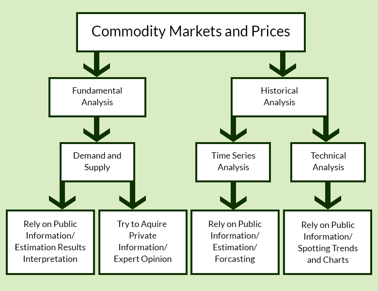
The first distinction to note is if the analyst focuses on changes in commodity demand and supply (fundamental analysis), or if the focus is instead on previous figures and information in order to assess future price fluctuations (historical analysis). Traders who use a fundamental analysis rely on supply and demand information, either reports/private information or data, which is analyzed using either descriptive or more advanced statistical tools. Analysts who uses historical analysis rely heavily on long data series of previous information and statistical methods (time series analysis), or alternatively, on qualitative methods based on spotting patterns on charts (technical analysis). In the explanation that follows, I will illustrate briefly how these approaches work to set the stage for the remainder of the course.
Fundamental Analysis
Fundamental analysis is based on the study of supply and demand movements and how they affect prices. Market analysts relying on fundamental analysis gather their information from a series of different resources, including the United States Department of Agriculture (USDA) and its services such as the National Agricultural Statistical Service (NASS). The analysis of data sources from NASS will be covered in detail in this lesson as well as in the lessons that follow.
Market Reports: USDA’s National Agricultural Statistics Service
Often, analysts rely on publicly available reports. Several full market reports and general information on the market for commodities are available from the USDA. Go to the USDA’s National Agricultural Statistics Service website, where you can download general information/data for different commodities:
- To view statistics by subject, select a sector, followed by a group and commodity. Let's select "Crops," "Fruit and Tree Nuts," and Apples.
- Set the type of report you are interested.
- Under "Choose Data Items," select the checkbox for “Apples – Production, Measure in LB.”
- Click the Continue button.
- On the next screen, you will see some national production statistics (click “more” on the table to see more data). You'll also see a series of likely publications, charts, and graphs where you can access more information.
- From the list of publications, select Noncitrus Fruits and Nuts - Jan Preliminary and July Annual.
- You will be redirected to a page containing a repository of reports, including annual and semi-annual reports for the production of fruit (excluding citrus) and nuts. The January reports contain a preliminary summary of last year’s market figures (sometimes redacted and corrected in February and/or March), while the July report presents the “final” figures. Please note that most market reports are PDFs, which makes their data not readily usable for further analysis. The reports also come in text file format; all the tables are available in ZIP folders for easier access.
Let's try another example: Let's say that you were looking for information on the mushroom market, prices, production, number of growers and utilization (both Agaricus and specialty types). The appropriate selections from the USDA’s National Agricultural Statistics Service website will take you to annual reports for this market. As an exercise, try to retrieve this information yourself.
You should reach the following section:
Market Reports: USDA Economic Research Service
Another avenue to obtain market information for different types of agricultural commodities (as well as assistance programs, farm economies, etc.) is through the USDA Economic Research Service website.
From there, you can access different types of information for animal products, crops, and most importantly for the focus of this course, markets and prices. You can retrieve information on food markets, food consumptions, and trends that exemplify hot and current trends in the food business, such as local foods, as well as supply chain information beyond the farm-gate (wholesaling, retailing, etc.).
Quick Stats Database
The NASS Quick Stats database is one of the most useful resources for analyzing agricultural commodity markets.
You should notice that there are two versions of the interface: Quick Stats 2.0 (which is the one that you will use) and Quick Stats Lite.
You may want to explore Quick Stats before you access the tutorial later in the lesson. On the Quick Stats Tool page, start by clicking the arrow for Quick Stats 2.0. From there, test out combinations of the various commodity, location, and time options. You should be aware that production statistics are available for both quantity and value for most commodities in the animals and products, crops, and demographics sectors. Information on fertilizers and pesticides can be discovered in the environmental sector. However, keep in mind that not all of the information in the Quick Stats database will be utilized in this course; for example, our main focus in the economics section will be price indexes.
Somtimes, the data you need to complete your fundamental analysis may not be available. In this case, a proxy can be constructed. For example, let's say you want to use data for actual food consumption. You'd want to use a proxy method like the USDA Economic Research Service's disappearance estimate, which essentially considers the total amount of food in the system (production + imports + initial stock), and subtracts the the food that "disappears" from supply (e.g., exports and final stock). This information would then stand as a proxy for the actual amount of food consumed, or the demand. More on this concept will be covered in Lesson 4.
Historical Analysis
Historical analysis is based on acquiring and using information regarding past fluctuations in prices (or other economic measures) to predict future changes. When the analysis is based on long-term time series data, a statistical regression analysis (time series analysis) can be used to review small intervals in this data. In theory, a longer time series produces better results. However, the reality is that by doing so, you run the risk of including shocks in your data. Therefore, it is important to consider the time period you are using before beginning your analysis. In contrast, a technical analysis focuses on specific short-term patterns in commodity trading to predict the trajectory of economic variables—usually prices. You'll rely heavily on charts and graphs to complete this form of analysis.
Technical analysis is particularly important when it comes to futures trading and developing futures contracts. Futures contracts are tools that allow you to commit to purchasing a specific amount of a commodity at a certain price and delivery date in order to gain a profit or protect against price fluctuations. I'll discuss futures contracts and their options in more detail later in the course.
Data on Prices From NASS
As previously mentioned, you can find agricultural commodity price data through the National Agricultural Statistical Service (NASS). The prices paid group in the economics sector on the NASS website should be one of the first places you look for price indexes for commodities and other inputs (including fertilizers, pesticides, and other production factors). This information will be vital to your time series analysis, as it generally requires a large amount of data on prices.
Let's walk through an example of retrieving NASS price information together:
- Choose the crops sector.
- For the group, select horticulture.
- Set mushrooms as the commodity.
- Under "Choose Data Items," scroll to and select "Mushrooms, Agaricus, Sales Measured in $/lb."
- For domain, select total.
- Set the geographic level to national.
- Click Continue.
You will see that in the case of mushrooms, only annual prices are available using “Get Data,” which you can visualize.
If you click "More" under the statistics table, you'll be redirected to the Quick Stats.
Other commodities, such as milk or eggs, will have monthly data available at the national and state levels, which could become a limitation for your analysis. You may need to search out other sources if you require weekly or daily prices.
Other Data Sources
There are several other data sources that you should consider as a market analyst, especially when performing a fundamental analysis and using statistical tools.
- U.S. Census Bureau: Economic conditions such as income, demographics, and additional statistics are available for your use. This information is particularly useful for comparing geographic locations. The American Fact Finder page is a good place to find information on different locations.
- U.S. Bureau of Labor Statistics: Data on unemployment and price indexes are available to assess the impact of inflation on consumers and producers. Unemployment rates are available at the national, state, and county levels. Additionally, the consumer price index can provide you with additional data on consumer purchasing power over an extended period of time. You should also refer to the producer price index when collecting data on the demand for goods.
The Role of Policy in the Determination of Prices
Changes in policies (agricultural or not) are an important determinant of market patterns and trends. Therefore, they should not be overlooked by market analysts, regardless of whether they use a fundamental or historical analysis. In a fundamental analysis, the role of policies is clear: Policies usually result in either supply or demand changes (or both). Their importance is marked although more nuanced in a historical analysis; for example, a sudden shock in demand or supply due to a change in policy (or a shock in prices) may lead to unusual fluctuations. Time series regression methods may not be able to account for these fluctuations properly, unless you are aware of their existence. As a consequence, unusual patterns in charts may be difficult to interpret regarding stakeholder behavior variations.
There are countless sources that you can rely on to acquire information on relevant policies. For example, the Farm Service Agency provides considerable information to farm operators regarding associated policy changes. Sector-specific organizations provide policy information on their sectors. One example is the International Dairy Foods Association, which discusses major dairy sector political issues.
Federal Marketing Orders
One type of policy that you should pay special attention to in your analysis is federal marketing orders. Historically, federal marketing orders function as a way to control local fluctuations in commodity prices. They do this by setting a minimum selling price, or a price floor. More recently, federal marketing orders have started to focus on standardizing production practices and providing technical support to farmers.
Simple Statistical Analysis Measures
Once your data have been collected and downloaded, you need to understand how to use the tools necessary to analyze them. In the remainder of this lesson, I am going to illustrate some simple statistical and descriptive measures that will enable you to properly describe a series of data. Regression analysis and more on economic modeling will be covered in the next lessons.
Mean: Describes the “center” of the distribution of a data series; it represents what you can expect, on average, to observe if you randomly select one instance from the series of data.
For finding the mean, let X be a data series made by n observations (x1,…,xn), that is n data points. The mean of the data series (or the average of the data series, or sample average) is then defined by
Median: Represents the middle point of a data series. If all the observations in the data series are sorted in either ascending or descending order, the median would be that data point that separates the sorted series in two halves.
The mean and the median are also called centrality measures of a data series. If they are close to one another, the data distribution is likely to be symmetric, and it should show some well-defined properties.
Mode: The data value with the largest number of observations; this value reoccurs the most in the data series. For a data series that presents only a few values, the mode is an important indicator because it allows you to see what the most reoccuring event is.
Variance: The measure of dispersion (or variability) of the data around their mean; it is calculated as the sum of the squared differences between the individual observations and the mean of the data series, divided by the number of observations minus 1:
It should be noted that when more observations are closer to the mean, the distribution of the data is tighter, or less dispersed, and the variance is small. When many observations are far from the mean, the distribution of the data is more dispersed and the variance is large. Data points that exist far from the rest are outliers, and they could cause the variance to be very large.
Standard Deviation: Another measure of dispersion, which is calculated as the square root of the variance. One of the main advantages of using the standard deviation in place of the variance is that it is expressed in the same unit of measure as the data.
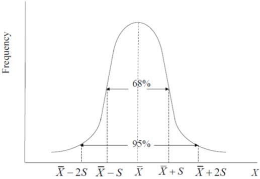
It is not uncommon to assess the dispersion of the data by considering how much of the data are “contained” within plus or minus” ( ± ) a certain number of standard deviations from the mean. It is customary to calculate intervals equal to one and two standard deviations above and below the mean. For many data series, the largest part of the observations fall within this interval. One classical example is the normal distribution.
Normal Distribution
A data series is distributed as normal (or follows a normal distribution) if
- its distribution is symmetric around its mean,
- the mean and median coincide (or mean = median),
- it is fully defined by its mean and standard deviation,
- 68% of the observations are within one standard deviation of the mean, and
- 95% of the values are within two standard deviations of the mean.
Large samples of data usually tend to be distributed normally; many consider data distributed normally to be “well behaved” because only the mean and standard deviation are needed to fully describe it
Covariance: A measure of how two variables change together is calculated by the sum of the product of the difference of each observation for a data series and its mean, divided by number of observations minus 1:
Correlation Coefficient: This is a bounded measure of how two variables change together. The correlation coefficient is calculated by dividing the covariance between two variables by the product of their standard deviations:
The main appeal of using the correlation coefficient instead of the covariance is that it is adimensional, meaning that it has no units of measurement. Since the correlation coefficent exists between -1 and 1, it allows the market analyst to quickly assess how much two variables move together along the graph. The larger the correlation coefficient (either positive or negative), the more the two variables vary together. Usually, 0.5 is considered as the rule of thumb to assess how my <<ED: Paragraph incomplete, please revise.
Video Tutorial
In the demonstration that follows, you will analyze two data series representing the U.S. domestic production of cheddar cheeses and Italian chesses to assess whether the two data series are related. Consider repeating this tutorial on your own as it will show you how to download and manipulate data from the USDA National Agricultural Statistics Services Quick Stats 2.0.
To complete the tutorial you can also access the file AGBM320_Lesson_2_complete.
PROFESSOR: In this tutorial, we will download and manipulate some data series from publicly available sources. The data that we will be using would be accessed via the Quick Stats 2.0 database of the USDA National Agricultural Statistics Service. You will find the link here on the slides. Also, please open the file AGBM 320 underscore lesson 2 underscore complete, which contains the final output of all the data manipulation and analysis that we will perform during this tutorial.
So I have already accessed the Quick Stats 2.0 database. In order to unload the data we need to follow a series of steps. The first thing that we have to do is to select from the program menu the Survey Label. Why? Because we are going to look for data which are collected on an annual basis, even on a monthly basis. While the census of agriculture are the economic census only take place in certain specific years.
From the Sector menu you're going to select Animal and Products. Then from Group, Dairy. From the Commodity menu we are going to select Cheese. You will see that new menus appear. Every time you select a different commodity or a different group, this software will generate alternative menus for you to choose your variables from. In the Category menu we select Production.
We will focus on two products-- cheddar cheese, which here is label us Cheese American Cheddar, and then Italian cheese. In order to collect both data, we need to hold the Control button down. So if we push Control, then we can select multiple data entries at once. Once we have selected the two data items that we want to download from the domain, we select Total, which in this case is the only option available.
Then we need to select the geographic level at which we want to data. For this example we're going to use national data. So for the National Data that is the only option given to US total. Next thing that we need to select is the years. We will select years from 2005 to 2014. Last thing that we need to select is whether we want to download annual or monthly data. And we'll select Monthly.
Which months do we want to download? All of them, all the calendar months. At this point, we are ready to download the data, and we can click on Get The Data. You will see a new screen appearing. Once the information appears on the screen, let's just quickly assess whether the data that we wanted to download had actually been downloaded. In this case, we have the production of cheddar cheese [INAUDIBLE] production of Italian cheeses and we have-- it takes a while to load. And we have all the data that we were looking for.
The next step is to download the file. We're going to download it as a spreadsheet. As you open the file, download it as a spreadsheet, I would suggest that you save it in Excel format. And you can use any name that you want. I'm going to call it Cheese Data, and you're going save it as an Excel workbook.
We need to do quite a bit of data manipulation in order to have the data ready to be analyzed. The first thing that you are going to do is to eliminate columns, which in this specific case-- beware, not in all the cases-- but in this specific case are not useful for us. We would be left with the year period, the data item, which is-- the data item color, which contains the indication of the different types of products that we are analyzing, and last, the value.
In order to use this data though, we need to order them in a way that we can evaluate-- and this is the goal of this tutorial-- how much the production of both products have changed over time. So we need to go to Data and Sort. We need to sort the variables using three different levels. In the first level, we're going to do data item. In the second, we're going to use the year. In the third level, we're going to use the period, which is the month.
So, in the case of the month, we need to use some special way to rearrange the cells. Otherwise Excel will automatically arrange them either in ascending or descending alphabetical order. So let's click on Custom List and select the option that allows us to use the calendar months.
Let's make sure that the box My Data Has Headers has been checked. And then we'll see that the data is organized in a way that we're going to have first of all the cheddar cheese data and then the Italian cheese data. So let's see rename these columns. We can rename these Cheddar. We write in cell E1 Italian.
Since the data is already organized, we can copy the production of Italian cheese from the bottom of our database so that we have the production for the Italian and cheddar cheese for the same calendar months close together with one another. We can now delete all the remainder of the data.
At this point, we can also delete the Data Item column. And we are left with a database which is ready to be analyzed. The first thing that is advisable to do every time you're working with a new database is to create a graph and see how the database behaves. Let's select the data first, and then let's click select either a line or a scatter database. Now, scatter plot and lines allow us to work with the data in a very easy way if we want to isolate trends.
Let's work with the scatter plot database. Let's make sure that the software knows which ones are variables of interest, which ones are not. Now we see that we have the two data series that are already plotted over time. We can add labels. We can add a title to this chart.
Now, in order to save time, we're just going to look at the complete database and see how the final graph should look like. We have added a title for the axis, which you obtained from right clicking to the y-axis. From the format axis, we have also changed the range. And then we have, in the y-axis, we have also changed the range, and we also changed the display units. So that the display units appears in millions.
For each data series we have added trend lines. The trend lines are linear. And we wanted to display the equation for each one of the two trend lines. So as you calculate the trend lines yourself, select Linear and Display Equation in Chart. We have already done this for both the Italian and the cheddar cheese line.
So you should notice a few things in this graph. First, there is quite a bit of fluctuations for the two time series. There is a lot of seasonality. One of the things that you should keep in mind that there is one month in the data where the production will be lower by construction, which is February. We're going to see some seasonality in the first place because simply by looking at the data. In February it will include fewer production days.
But the trend lines we can see also that in spite of both productions to have increased considerably in the 10 years that we are analyzing, the production of Italian cheeses as increased on average monthly by 820,000 pounds per month, the one for cheddar cheese only by 100,000. Both markets are growing, but definitely the market for Italian cheeses is growing much faster.
The next thing that we need to look at when we look at data series is how the two databases are distributed. Excel gives us the option of running detailed data analysis using summary statistics or descriptive statistics. In order for you to have the data analysis tools installed in your Excel, you should perhaps look at whether or not you have it in your options. So, if you look at your Options and the Add-Ins, you should see that the Analysis Tool Pack is installed. Otherwise you need to select it and install it.
During the entire course, we will repeatedly use functions or tools which are contained in the Analysis Too Pack. So it would be a good idea if that was installed in your Excel. If you follow the instructions that are given to you, you could run descriptive statistics. In order to run descriptive statistics, the first thing that you need to do is select both data series.
Go to Data Analysis, go to Descriptive Statistics. You can set up your input range, again, if the software has not found it yet. Make sure that the software knows that you have selected columns that are labels in the first row and that we want summary statistics. We need these new output to be delivered in a new worksheet.
This was already done here in the complete file. So what we obtain are values of the mean, the standard error, this medians, the mode, and so forth. Now we can see that in both cases, the median and the mean are relatively close. This is a good indication that overall probably these two data serious might be close to normal.
We can see also that the variance of the cheddar cheese production is smaller than the one of the Italian, and the same for the standard deviation. That might be because the data series for Italian is larger in magnitude overall and also because there is larger variation as the upward trend is more marked. Another thing that you're asked to do is to calculate these two amounts, the mean plus 2 times the standard deviation, which was calculated, as you can see, and the mean minus 2 times the standard deviation. Here again, it was already calculated for you.
Why do we need to calculate these two measures? Because if the data are distributed normally, we will see that approximately 90% of the data points are within plus and minus two standard deviations from the mean. And let's compare the mean and the maximum with the mean plus 2 standard deviations, the mean minus 2 standard deviation. Well, the mean minus 2 standard deviation is slightly higher than the minimum for both the data series. The mean plus 2 standard deviation in the case of Italian is slightly lower than the maximum. In the case of the cheddar, it's instead slightly higher than the maximum. So if anything, the cheddar production data is slightly less likely to be distributed as a normal distribution, compared to the Italian cheeses data.
One last statistic so we want to evaluate is the correlation between the two data series. You can follow the instructions that are given to you. Simply look at the values that is reported in the AGBM 320 underscore lesson 2 underscore complete. In this case, the correlation between the two data series is less than 0.5, which means that the two data series are only weakly correlated from one another. Even though the two markets can be relate because we are looking at production of similar products, it seems like there might be different driving market forces. The last thing that we are going to do for these data sources is to use, again, the Data Analysis Toolkit to create histograms on each one of these two data series.
We're going to click on Data Analysis Histogram. Click on OK. Select the Input Range. We're going to do this for cheddar. Make sure that you check the box Labels and that you select both the Cumulative Percentage [INAUDIBLE] Output. Make sure that the graph and the output is delivered in a new worksheet. This will sort it out for you.
And we have the Histogram Cheddar and the Histogram Italian charts already ready for you to consult. We can look at them in the [INAUDIBLE] presentation. Overall we'll learn a few things about these two markets. The production of both cheddar cheese and Italian cheeses is increasing. The one for Italian cheeses is increasing much more than that of cheddar cheese. The data series show wide marked seasonality, and also the Italian cheese production data, given the evidence that we have found from the summary statistics and from the histogram, seems a lot more likely to be distributed as normal.
You can see that the distribution of the cheddar cheese production data is actually more skewed to the right, while the distribution of the Italian cheese production data is more concentrated towards the center. All the steps that we have taken just to have an need idea of our data serious behavior is something that you should keep in mind every time you download and analyze any data series, especially time series of data.