Main Content
Lesson 1: Decision Making Under Uncertainty

Why Statistics?
Adapted from Five Guidelines for Using Statistics, 2006.
Are defects declining? Is customer satisfaction rising? Did the training seminar work? Is production meeting warranty standards? You inspect the numbers but you are not sure whether or not to believe them. It isn't that you fear fraud or manipulation; it's that you don't know how much faith to put in the statistics.
You are right to be cautious. "The actual statistical calculation represents only 5% of the manager's work," declared Harvard Business Professor Frances Frie. "The other 95% should be spent determining the right calculations and interpreting the results." Here are some guidelines for effective use of statistics.
Know what you know and what you are only asserting
In real life, managers do not do as much number-crunching as they think. Managers are primarily idea crunchers: they persuade people with their assertions. However, they often do not realize the extent to which their assertions rest on unproven assumptions. Victor McGee of Dartmouth College recommends color coding your "knowledge" so you know what needs to be tested. Red can represent your assumptions, yellow is what you "know" because of what you assume, and green is what you know. Assumptions and assertions (red and yellow knowledge) shouldn't be taken seriously and promote action unless data supports the action (green knowledge).
Be clear about what you want to discover
Some management reports rely heavily on the arithmetic mean or average of a group of numbers. But look at Figure 1.1, a bar graph analyzing customer satisfaction survey results on a scale of 1 to 5. For this data set, the mean is 4. If that's all you saw, you might figure people are satisfied. But as the figure shows, no one gave your product a rating of 4: instead, the responses cluster around a group of very satisfied customers, who scored it a 5, and moderately satisfied customers, who gave it a 3. Only by deciding that you wanted to look for subgroups within the customer base could you have known that the mean would not be the most helpful metric. Always ask the direct question, "What do you want to know?"

Don't take cause and effect for granted
Management is all about finding the levers that will affect performance. If we do such and such, then such and such will happen. But this is the world of red and yellow knowledge. Hypotheses depend on assumptions made about causes, and the only way to have confidence in the hypothetical course of action is to prove that the assumed causal connections do indeed hold.
Suppose you are trying to make a case for investing more heavily in sales training, and you have numbers to show that sales revenues increase with training dollars. Have you established a cause-and-effect relationship? No. All you have is a correlation. To establish genuine causation, you need to ask yourself three questions. Is there an association between the two variables? Is the time sequence accurate? Is there any other explanation that could account for the correlation?
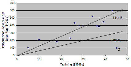
It can be wise to look at the raw data, not just the apparent correlation. Figure 1.2 shows a scatter diagram plotting all the individual data points (or observations) derived from the study of the influence of training on company performance. Line A, the "line of best fit" that comes as close as possible to connecting all the individual data points, has a gentle upward slope. But if you remove Point Z from the data set, the line of best fit becomes Line B, with a slope nearly twice as steep as Line A. If removing a single data point (or in some instances a small proportion of the data points) causes the slope of the line to change significantly, you know this point (or points) is unduly influencing the results. Depending on the question you are asking, you should consider removing it from the analysis.
on Company Performance
For the second question—Is the time sequence accurate?—the problem is establishing which variable in the correlation occurs first. The hypothesis is that training precedes performance, but one must check the data carefully to make sure the reverse isn't true; that it is the improving revenue that drives the increase in training dollars.
Question 3—Can you rule out other plausible explanations for the correlation?—is the most time-consuming. Is there some hidden variable at work? For example, are you hiring more qualified salespeople and is that why performance has improved? Have you made any changes to the incentive system? Only by eliminating other factors can you establish the link between training and performance with any conviction.
With statistics, you can't prove things with 100% certainty
Only when you have recorded all the impressions of all the customers who have had an experience with a particular product can you establish certainty about customer satisfaction. But that would cost too much time and money, so you take random samples instead. A random sample means that every member of the customer base is equally likely to be chosen. Using non-random samples is the number one mistake businesses make when sampling. All sampling relies on the normal distribution and central limit theorem. These principles enable you to calculate a confidence interval for an entire population based on sample data. Suppose you come up with a defect rate of 2.8%. Depending on the sample size and other factors, you may be able to say that you are 95% confident that the actual defect rate is between 2.5% and 3.1%. Incidentally, as you get better and have fewer defects, you will need a larger sample to establish a 95% confidence interval. A situation of few defects requires that you spend more, not less, on quality assurance sampling.
A result that is numerically or statistically significant may be managerially useless and vice versa
Take a customer satisfaction rating of 3.9. If you implemented a program to improve customer satisfaction, then conducted some polling several months later and found a new rating of 4.1, has your program been a success? Not necessarily. In this case, 4.1 may not be statistically different from 3.9 because it fell within the confidence level.
Because managers can be unaware of how confidence intervals work, they tend to over-celebrate and over-punish. For example, a vice president might believe the 4.1 rating indicates genuine improvement and award a bonus to the manager who launched the new customer satisfaction program. Six months later when the rating has dropped back to 3.9, he might fire the manager. In both instances, the decisions would have been based on statistically insignificant shifts in the data. However if new sampling produced a rating outside the confidence interval (e.g., 4.3), the executive could be confident that the program was having a positive effect.
Be clear about what you want to discover before you decide on the statistical tools. Make sure you have established genuine causation, not just correlation while remembering that statistics do not allow one to prove anything with complete certainty. Also, keep in mind that not all results are statistically significant or managerially useful. Although the perspectives offered here will not qualify you to be a high-powered statistical analyst, they will help you decide what to ask of analysts whose numbers you may rely on!
Reference
Five guidelines for using statistics. HBS Working Knowledge. (2006). Retrieved August 9, 2022, from https://hbswk.hbs.edu/archive/five-guidelines-for-using-statistics.