Demo 2 Transcript
Lesson 2
Demonstration 2 – Recording of Problems from Chapter 2
A Grouped Frequency Distribution Table
For the following set of N=20 scores, construct a grouped frequency distribution table using an interval width of 5 points. The scores are:
| 14 | 8 | 27 | 16 | 10 | 22 | 9 | 13 | 16 | 12 |
| 10 | 9 | 15 | 17 | 6 | 14 | 11 | 18 | 14 | 11 |
INSTRUCTOR: The goal of this example is to generate a frequency distribution table based on a set of scores. So what you see here is a set of 20 scores, and you are asked to generate a frequency distribution table using an interval width of 5 points.
Now, to determine what your interval should be, a good thing to always remember is what your minimum and maximum values are. So in the data we have, the lowest value is the 6, right here, and the highest value is 27, right here. So what you want is to use about 5 or 6 intervals, each with a width of 5 points and they need to include values in between 6 and 27. So, here is what we do:
First you write x, to indicate that you are working with the values for x, and we can have the first interval go from 5 up to 9, a second one from 10 up to 14, then one from 15 to 19, one from 20 to 24, and one from 25 up to 29.
| x | f |
|---|---|
| 5 to 9 | 4 |
| 10 to 14 | 9 |
| 15 to 19 | 5 |
| 20 to 24 | 1 |
| 25 to 29 | 1 |
Then, the second step, we need to determine the actual frequency of each of those categories. So in other words, we need to know how many values fall within each of those categories? So, we will denote that with the letter f for frequency.
So how many scores fall between the interval 5-9? Well, we have an 8 here which is in there, and a 9 will be in there. The 6 will be in there and 9 will be in there and that's it. So a total of 4 values would fall within the interval of 5-9. So we put a 4 in our frequency distribution table.
Then we do the same for the category from 10 to 14. We have a 14 here, that's one, a 10 here, that's 2, a 10 here, that's 3, a 14 here, that's 4, 11 here, that's 5, a 13 here, that 6, a 14 here, that's 7, a 12 here, that's 8, and 11 there, that's 9. So, a total of 9 values. Then for 15 to 19, we do the same thing. We find a 15 here, that's 1, a 16 here, that's 2, a 17 here, that's 3, an 18 here, that's 4, and 16 there, that's 5. So a total of 5 values. Then from 20 to 24, we see a 22 here, and that's the only value in that interval so we get a frequency of 1. Then from 25 to 29, we just have our highest value of 27 that falls in that interval, so that's also 1. And now as you see here, we have our frequency distribution table.
Now what we can do is take that table and also make a graph out of it.
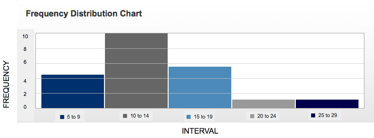
So first, let's put down the axes. And on our axes, what we will have is our categories, so our intervals. So we have one from 5 to 9, one from 10 to 14, one from 15 to 19, one from 20 to 24, and one from 25 to 29. Now what you want is for them to all look about the same width, so let's correct this guy here and put the line in such a way that it's about in the middle.
On our y-axis, we need to label the actual frequency values. So we'll start with a 0 on the bottom and then increase it by 2's. Our highest value is a 9 and our lowest is a 1. So we have 0, 2, 4, 6, 8, and at the very top will be 10. So to plot our first interval at it's corresponding frequency, that's a frequency of 4, so we want to draw the line at the height 4 for that particular interval. Then the next one is 9 so that would be about there. That's a little crooked so I'll take that line out and re-do that for a second. That's better. Our next value is a 5, so we'll draw that at a height of 5, then we have a frequency of 1, so the next category is 1, and then the same for the last category, so a frequency of 1. Remember that's the highest score of 27. And as you see here, we have our frequency distribution table.
Now what you want to do is label the axes. So you would say on the x- axes we put our interval, so label it INTERVAL, and on the y-axes is frequencies, so you would label FREQUENCY. And so, we're done.