WCLD101:

Scripts and Tools

Large Banner WC Show Hide (1 of 29)
Large Banner WC Show Hide

WC Show Hide: Overview

The WC Show Hide script is an improved version of the old show/hide scripts.  By using HTML and CSS you can set almost any set of objects to show on a single click, show/hide as a a toggle, show/hide as a radio series, and/or show/hide on hover. 

Under the hood...

Under the hood...

WC Show Hide is our custom jquery plugin.  jQuery is a collection javascript code libraries that we can reuse for our own purposes. 

WC Show Hide works by detetecting what happens to any HTML object and then adding classes to HTML objects based on what happens.  If an object with the clickme class is clicked or hovered over, WC Show Hide gets the id of this object and searches for all HTML objects with the showme class that have classes that match this id.

For example, an object with the class clickme and the id example1 is clicked.  WC Show Hide adds the click class to all objects that have both the showme and example1 classes.

The following are styles added by WC Show Hide:

In general, all WC Show Hide scripts will require the following:

To see some examples in action, view the following pages in this TEMPLATE 101 lesson.

Click to Show Tutorial (2 of 29)
Click to Show Tutorial

Click to Show Tutorial

WC Show Hide has a click class that allows you to create content to appear after an object is clicked and then remain shown.  The following is a simple example of what you can do with the click class:

Click Me Show Me

The CSS

The WC Show Hide requires CSS styles to be added. You can do this by linking to a content.css and pasting the folowingCSS into that file:

/* style your clickme images */
.clickme { [add additional styles for clickme images] }
.clickme:hover { [add additional styles for hovering on clickme images] }

/* style your showme content... */
/*default appearance before it is clicked */
.showme { display: none; }

/* "click" appearance for after it is clicked, and, for accessibility purposes,
show "nojs" for those who do not have javascript and cannot get javascript to recognize the click */
.showme.click, .showme.nojs {
display: block;
[add additional styles for showme content]
}

/* add other styles as needed to style the images and content */

The HTML

Use the CSS above along with any additional styles you need. Then add HTML similar to the example below:

<div>
<div class="clickme" id="simpleclick01">Click Me</div>
<div class="showme simpleclick01 nojs">Show Me</div>
</div>
Toggle to Show/Hide Tutorial (3 of 29)
Toggle to Show/Hide Tutorial

Toggle to Show/Hide Tutorial

WC Show Hide has a toggle class. Toggle allows you to create content to appear and disappear after an object is clicked.  The following are examples of what you can do with the toggle class:

Simple Toggle

Toggle Me
Show Me
The CSS

The WC Show Hide requires CSS styles to be added. You can do this by linking to a content.css and pasting the folowingCSS into that file:

/* style your clickme images */
.clickme { [add additional styles for clickme images] }
.clickme:hover { [add additional styles for hovering on clickme images] }

/* style your showme content */
.showme { display: none; }
.showme.toggle, .showme.nojs {
display: block;
[add additional styles for showme content]
}

/* add other styles as needed to style the images and content */
The HTML

Use the CSS above along with any additional styles you need. Then add HTML similar to the example below:

<div>
<div class="clickme" id="simpleclick01">Toggle Me</div>
<div class="showme simpleclick01 nojs">Show Me</div>
</div>

Advanced Toggle

ShowHide
Show Me
The CSS

Like the previous example, WC Show Hide requires CSS styles to be added to your content.css for advanced toggle function.

/* add default styles to clickable objects */
.clickme { color: blue; text-decoration: underline; }
.clickme:active, .clickme:hover { text-decoration: none; }

/* style your showme content... */
/*default appearance when it is toggled off */
.showme { display: none; }

/* "toggle" appearance for when it is clicked on, and, for accessibility purposes,
show "nojs" for those who do not have javascript and cannot get javascript to recognize the click */
.showme.toggle, .showme.nojs { display: block; }

/* style the "Show" and "Hide" links so that the approproate text is shown */
.showtxt.showme { display: block; }
.showtxt.showme.toggle { display: none; }
.hidetxt.showme { display: none; }
.hidetxt.showme.toggle { display: block; }
The HTML

Use the CSS above along with any additional styles you need. Then add HTML similar to the example below:

<div class="clickme" id="example00">
<!-- Separate the two states for the clickable object into showtxt and hidetxt classes. Both will have the showme style. -->
<span class="showtxt showme example00">Show</span>
<span class="hidetxt showme example00">Hide</span>
</div>

<div class="showme example00">Show Me</div>
Hover to Show or Hide Tutorial (4 of 29)
Hover to Show or Hide Tutorial

Hover to Show or Hide Tutorial

WC Show Hide has a hover class. Hover allows you to create content to appear and disappear as the mouse hovers on an object.  The following is an example of what you can do with the hover class:

Hover on Me Show Me

The CSS

The WC Show Hide requires CSS styles to be added. You can do this by linking to a content.css and pasting the folowingCSS into that file:

/* style your clickme images */
.clickme { [add additional styles for clickme images] }
.clickme:hover { [add additional styles for hovering on clickme images] }

/* style your showme content... */
/*default appearance before it is clicked */
.showme { display: none; }

/* "hover" appearance for after it is clicked, and, for accessibility purposes,
show "nojs" for those who do not have javascript and cannot get javascript to recognize the hover */
.showme.hover, .showme.nojs {
display: block;
[add additional styles for showme content]
}

/* add other styles as needed to style the images and content */

The HTML

Use the CSS above along with any additional styles you need. Then add HTML similar to the example below:

<div>
<div class="clickme" id="simpleclick01">Hover on Me</div>
<div class="showme simpleclick01 nojs">Show Me</div>
</div>
Show/Hide as Radio Series Tutorial (5 of 29)
Show/Hide as Radio Series Tutorial

WC Show Hide: Show/Hide as Radio Series

WC Show Hide has a radio class. Radio allows you to create groups of content that function like a radio group, where only one clickable object and corresponding content item will be displayed at a time.  The following are examples of what you can do with the radio class:

Simple Radio

Click Here 1
Show Me 1
Click Here 2
Show Me 2
Click Here 3
Show Me 3
The CSS

The WC Show Hide requires CSS styles to be added. You can do this by linking to a content.css and pasting the folowingCSS into that file:

/* style your clickme images */
.clickme { [add additional styles for clickme images] }
.clickme:hover { [add additional styles for hovering on clickme images] }

/* style your showme content... */
/*default appearance before it is selected */
.showme { display: none; }

/* "radio" appearance for after it is selected, and, for accessibility purposes,
show "nojs" for those who do not have javascript and cannot get javascript to recognize the click */
.showme.radio, .showme.nojs {
display: inline;
[add additional styles for showme content]
}

/* add other styles as needed to style the images and content */
The HTML

Use the CSS above along with any additional styles you need. Then add HTML similar to the example below:

<dl id="simpleradio">
<dt class="clickme" id="example01">Click Here 1</dt>
<dd class="showme example01 nojs">Show Me 1</dd>
<dt class="clickme" id="example02">Click Here 2</dt>
<dd class="showme example02 nojs">Show Me 2</dd>
<dt class="clickme" id="example03">Click Here 3</dt>
<dd class="showme example03 nojs">Show Me 3<</dd>
</dl>

Radio with Default Selection

Click Here 1
Show Me 1
Click Here 2
Show Me 2
Click Here 3
Show Me 3

Use the CSS above along with any additional styles you need. Then add HTML similar to the example below:

<dl id="simpleradio">
<dt class="clickme" id="example01">Click Here 1</dt>
<dd class="showme example01 nojs radio">Show Me 1</dd>
<dt class="clickme" id="example02">Click Here 2</dt>
<dd class="showme example02 nojs">Show Me 2</dd>
<dt class="clickme" id="example03">Click Here 3</dt>
<dd class="showme example03 nojs">Show Me 3<</dd>
</dl>
Expand and Collapse (6 of 29)
Expand and Collapse

Expand and Collapse

You can use the toggle class of WC ShowHide to create expand and collapse functionality:

Expand and Collapse Text

Here is an example of expand and collapse text click here to showhide the details below.

Here is more text that displays.

The CSS

The WC Show Hide requires CSS styles to be added. You can do this by linking to a content.css and pasting the folowing CSS into that file:

/* style your showme content... */
/*default appearance when it is toggled off */
.showme { display: none; }

/* "toggle" appearance for when it is clicked on, and, for accessibility
purposes, show "nojs" for those who do not have javascript and cannot get
javascript to recognize the click */
.showme.toggle, .showme.nojs { display: inline; }

/* style the "Show" and "Hide" links so that the approproate text is shown */
.showtxt.showme { display: inline; }
.showtxt.showme.toggle { display: none; }
.hidetxt.showme { display: none; }
.hidetxt.showme.toggle { display: inline; }
The HTML

Use the CSS above along with any additional styles you need. Then add HTML similar to the example below:

<p>INSERT TEXT HERE
<a href="#" class="clickme" id="textexample">
<span class="showtxt textexample showme">Show</span>
<span class="hidetxt textexample showme">Hide</span>
</a>
</p>

<p class="textexample showme nojs">INSERT HIDDEN CONTENT HERE</p>

Expand and Collapse Icon

NOBODY expects the Spanish Inquisition! Amongst our weaponry...  

  • fear
  • surprise
  • ruthless efficiency...
The CSS

The WC Show Hide requires CSS styles to be added. You can do this by linking to a content.css and pasting the folowing CSS into that file:

/* style your showme content... */
/*default appearance when it is toggled off */
.showme { display: none; }

/* "toggle" appearance for when it is clicked on, and, for accessibility
purposes, show "nojs" for those who do not have javascript and cannot get
javascript to recognize the click */
.showme.toggle, .showme.nojs { display: inline; }

/* style the "Show" and "Hide" links so that the approproate text is shown */
.showtxt.showme { display: inline; }
.showtxt.showme.toggle { display: none; }
.hidetxt.showme { display: none; }
.hidetxt.showme.toggle { display: inline; }

/*style for icon*/
.sm_iconbutton3d img {margin: 5px 0 0 3px;}
The HTML

Use the CSS above along with any additional styles you need. Then add HTML similar to the example below:

<p>INSERT TEXT HERE 
<a href="#" class="clickme sm_iconbutton3d" id="iconexample">
<img src="./04_topic/images/arrow_dn.png" class="showtxt iconexample showme"/>
<img src="./04_topic/images/arrow_up.png" class="hidetxt iconexample showme"/>
</a>
</p>

<div class="iconexample showme nojs">INSERT HIDDEN CONTENT HERE</div>

Expand and Collapse 3D Button

Under the hood...

Under the hood...

WC Show Hide is our custom jquery plugin.  jQuery is a collection javascript code libraries that we can reuse for our own purposes. 

WC Show Hide works by detetecting what happens to any HTML object and then adding classes to HTML objects based on what happens.  If an object with the clickme class is clicked or hovered over, WC Show Hide gets the id of this object and searches for all HTML objects with the showme class that have classes that match this id.

For example, an object with the class clickme and the id example1 is clicked.  WC Show Hide adds the click class to all objects that have both the showme and example1 classes.

The CSS

The WC Show Hide requires CSS styles to be added. You can do this by linking to a content.css and pasting the folowing CSS into that file:

/*style for 3D button */
#showbtn {display:inline-block;}
#showbtn.nojs, #showbtn.toggle {display:none;}

/*style for under the hood container */
#showmorebox {display:none;}
#showmorebox.nojs, #showmorebox.toggle {display:block;}
The HTML

Use the CSS above along with any additional styles you need. Then add HTML similar to the example below:

<!-- button when nothing else is shown -->
<p class="button3d clickme showme hidebtn showbtn nojs" id="showbtn">INSERT BUTTON TITLE HERE</p>

<!-- content and button -->
<div class="newcolorbox showme showbtn hidebtn nojs" id="showmorebox">
<p class="button3d clickme" id="hidebtn">INSERT BUTTON TITLE HERE</p>
INSERT HIDDEN CONTENT HERE
</div>
Clickable Thumbnails (7 of 29)
Clickable Thumbnails

Clickable Thumbnails

WC Show Hide has built-in clickable thumbnail functionality. The following are examples of clickable thumbnail sizes when you link to a large image file:

Thumbnail 100
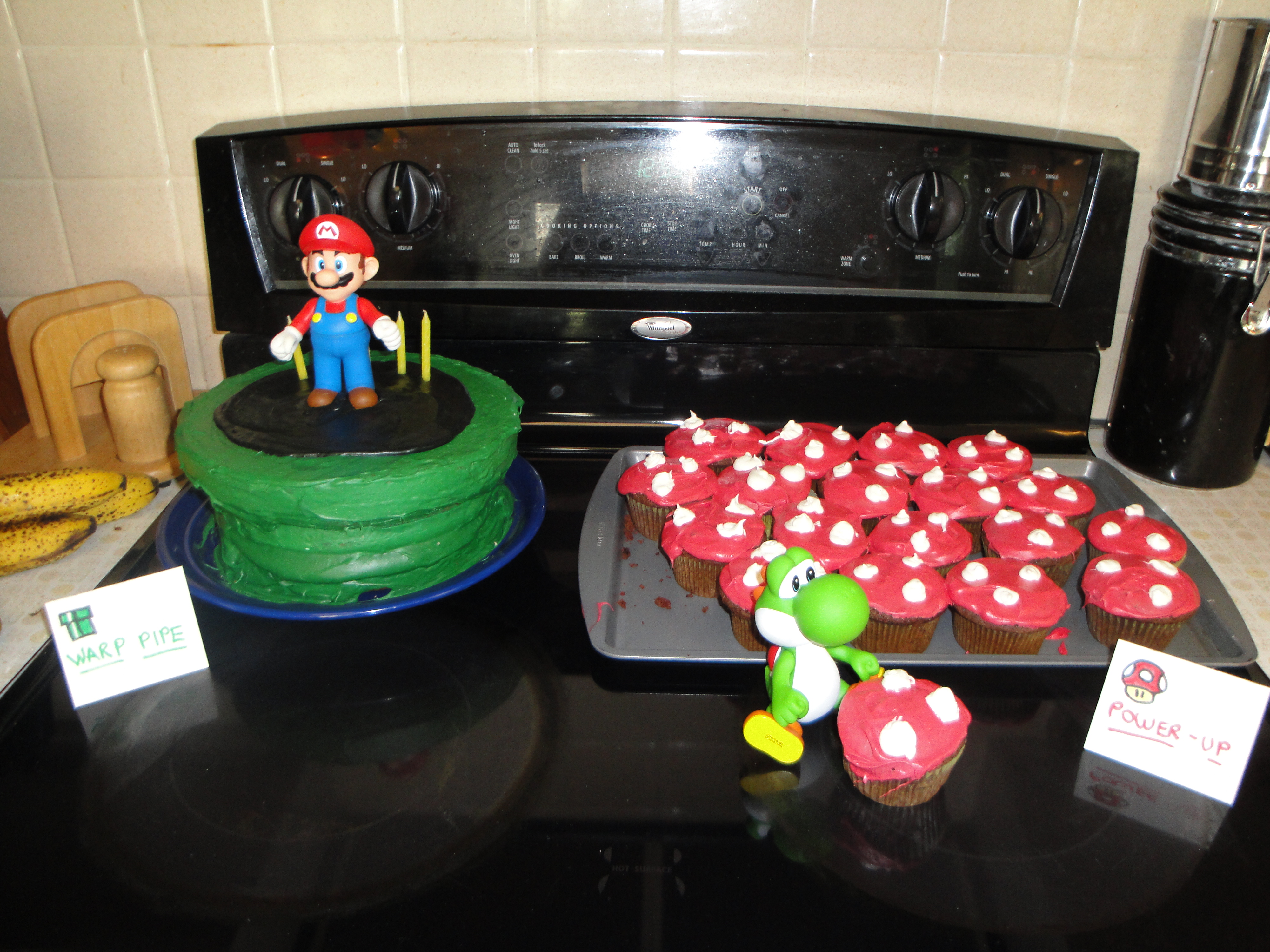
Mario CakesThis is a thumbnail image style at 100 pixels wide. The original image is much wider. If you click on it once, it will increase to 100% of the template width. If you click on it again, it toggles back to 100 pixels wide. All you need is the following HTML:

<img id="example01" src="INSERT IMAGE HERE" alt="INSERT ALT TAG HERE" class="thumbnail100 example01 showme clickme"/>

Thumbnail 150

Mario CakesThis is a thumbnail image style at 150 pixels wide. The original image is much wider. If you click on it once, it will increase to 100% of the template width. If you click on it again, it toggles back to 150 pixels wide. All you need is the following HTML:

<img id="example02" src="INSERT IMAGE HERE" alt="INSERT ALT TAG HERE" class="thumbnail150 example02 showme clickme"/>

Thumbnail 200

Mario CakesThis is a thumbnail image style at 200 pixels wide. The original image is much wider. If you click on it once, it will increase to 100% of the template width. If you click on it again, it toggles back to 200 pixels wide. All you need is the following HTML:

<img id="example03" src="INSERT IMAGE HERE" alt="INSERT ALT TAG HERE" class="thumbnail200 example03 showme clickme"/>

Thumbnail 250

Mario CakesThis is a thumbnail image style at 250 pixels wide. The original image is much wider. If you click on it once, it will increase to 100% of the template width. If you click on it again, it toggles back to 250 pixels wide. All you need is the following HTML:

<img id="example04" src="INSERT IMAGE HERE" alt="INSERT ALT TAG HERE" class="thumbnail250 example04 showme clickme"/>

Thumbnail 300

Mario CakesThis is a thumbnail image style at 300 pixels wide. The original image is much wider. If you click on it once, it will increase to 100% of the template width. If you click on it again, it toggles back to 300 pixels wide. All you need is the following HTML:

<img id="example05" src="INSERT IMAGE HERE" alt="INSERT ALT TAG HERE" class="thumbnail300 example05 showme clickme"/>

Thumbnail 350

Mario CakesThis is a thumbnail image style at 350 pixels wide. The original image is much wider. If you click on it once, it will increase to 100% of the template width. If you click on it again, it toggles back to 350 pixels wide. All you need is the following HTML:

<img id="example06" src="INSERT IMAGE HERE" alt="INSERT ALT TAG HERE" class="thumbnail350 example06 showme clickme"/>
Interactive Clickable Images (8 of 29)
Interactive Clickable Images

Interactive Clickable Images

The WC Show Hide allows you to create interactive content from text and images HTML and CSS. The benefits to using WC Show Hide for interactivity are as follows:

The examples below were used in COMM 180 to help visualize the differences between vertical and horizontal integration:

Vertical Integration

A vertically integrated company might try to harm competitors at each level. The government has a variety of rules in place to prevent these kinds of anticompetitive behaviors.

Click on the images below to see an example:

Horizontal Integration

Horizontal integration refers to when a company operates at the same level in multiple markets. For example, Disney owns local television stations in multiple cities. Disney also owns multiple cable networks and even multiple film studios. The same is true for Comcast, which also owns local cable systems all over the country. Horizontal integration allows companies to take advantage of economies of scale and to increase market shares. 

Click on the examples of Viacom examples above to learn more about horizontal integration.

Comedy Central is owned by Viacom.
MTV is owned by Viacom.
BET is owned by Viacom.
Vertical Layout for Interactive Images (9 of 29)
Vertical Layout for Interactive Images

Vertical Layout for Interactive Images

The WC Show Hide allows you to create interactive content from text and images HTML and CSS. You can use spacial relationships to convey ideas. The examples below were used in COMM 180 to help visualize the differences between vertical and horizontal integration:

A vertically integrated company might try to harm competitors at each level. The government has a variety of rules in place to prevent these kinds of anticompetitive behaviors. Click on the images below to see an example:

The example above of clickable images in a vertical layout will require the following:

    Create a list.

    Add HTML similar to the example below:

    <!-- a clickable list of items -->
    <p>INSERT INSTRUCTIONS HERE</p>
    <ul class="interactive-vertical">
    </ul>
    <!-- end clickable list of items -->

    Insert a list item for each clickable image.

    Inside the ul of the HTML you just added, you will add a list item (li) for each clickable image. Remember to replace the three references of IMAGE-ID-HERE with the unique id you give each image:

    <!-- a clickable list of items -->
    <p>INSERT INSTRUCTIONS HERE</p>
    <ul class="interactive-vertical">
    <!-- one clickable item -->
    <li>
    <div class="clickme" id="IMAGE-ID-HERE">
    <div class="caption IMAGE-ID-HERE showme nojs">INSERT IMAGE #1 CAPTION HERE</div>
    </div>
    <div class="details IMAGE-ID-HERE showme nojs">INSERT IMAGE #1 DESCRIPTION HERE</div>
    </li>
    <!-- end clickable item -->
    </ul>
    <!-- end clickable list of items -->

    Add the CSS.

    The CSS creates the interactivity. You can add the CSS by linking to a content.css and adding some CSS. For each clickable image you wish to add, add the code below. Replace IMAGE-ID-HERE with the unique id of the image and images/IMAGE-URL-HERE.jpg with url to that image.

    #IMAGE-ID-HERE {background:url('images/IMAGE-URL-HERE.jpg') center center no-repeat;}
    Horizontal Layout for Interactive Images (10 of 29)
    Horizontal Layout for Interactive Images

    Horizontal Layout for Interactive Images

    Click on the examples of Viacom examples above to learn more about horizontal integration.

    Comedy Central is owned by Viacom.
    MTV is owned by Viacom.
    BET is owned by Viacom.

    The example above of clickable images in a horizontal layout will require the following:

      Create a list and a details container.

      Add HTML similar to the example below:

      <!-- a clickable list of items -->
      <ul class="interactive-vertical">
      </ul>
      <!-- end clickable list of items -->

      <!-- details container -->
      <div class="details-horizontal">
      <p>INSERT INSTRUCTIONS HERE</p>
      </div>
      <!-- end details container -->

      Tip: You can style the details box like the example above by adding one of the Content Box styles to it.

      Insert a list item and a details item for each clickable image.

      Inside the ul of the HTML you just added, you will add a list item (li) for each clickable image. Remember to replace the three references of IMAGE-ID-HERE with the unique id you give each image:

      <!-- a clickable list of items -->
      <ul class="interactive-horizontal">
      <!-- one clickable item -->
      <li>
      <div class="clickme" id="IMAGE-ID-HERE">
      <div class="caption IMAGE-ID-HERE showme nojs">INSERT IMAGE #1 CAPTION HERE</div>
      </div>
      </li>
      <!-- end clickable item -->
      </ul>
      <!-- end clickable list of items -->

      <!-- details container -->
      <div class="details-horizontal">
      <p>INSERT INSTRUCTIONS HERE</p>
      <div class="details IMAGE-ID-HERE showme nojs">INSERT IMAGE #1 DESCRIPTION HERE</div>
      </div>
      <!-- end details container -->

      Tip: The your details container set up with div tags, p tags, or even a list with list items (li), as long as you add the approrpriate classes to them.

      Add the CSS.

      The CSS creates the interactivity. You can add the CSS by linking to a content.css and adding some CSS. For each clickable image you wish to add, add the code below. Replace IMAGE-ID-HERE with the unique id of the image and images/IMAGE-URL-HERE.jpg with url to that image.

      #IMAGE-ID-HERE {background:url('images/IMAGE-URL-HERE.jpg') center center no-repeat;}
      Interactive Process Diagram (11 of 29)
      Interactive Process Diagram

      Coming soon!

      WC Anchor Nav for Anchor Menus (12 of 29)
      WC Anchor Nav for Anchor Menus

      WC Anchor Nav for Anchor Menus

      With the built-in WC Anchor Nav tool, you can let Evolution create anchor menus and back-to-top links automatically for you. All the WC Anchor Nav requires is the following:

      The Anchor Menu Placeholder

      To create an anchor menu like the one above first place the following code where you would like the anchor menu to appear:

      <p id="anchormenu">&nbsp;</p>
      Tip:You can add a class that heading tag you wish to exclude from the anchor menu. For example, to exclude the header 3 I used at the top of this page, I used <p id="anchormenu" class="h3">&nbsp;</p>.

      Heading Tags with Unique IDs

      To populate the anchor menu, add a unique id to each heading tag:

      <h3 id="heading">Example Heading</h3>
      [content here]
      <h4 id="subheading">Example Subheading</h4>
      [content here]
      WC Anchor Nav for Anchor Menu Lists (13 of 29)
      WC Anchor Nav for Anchor Menu Lists

      WC Anchor Nav for Anchor Menu Lists

      You can also style your anchor menus in one of the following list styles:

      Tip: You can style anchor menus the same way you would style any other list. The example anchor menu at the top of this page, is styled with class="arrow".

      Ordered Lists

      To create an anchor menu as an ordered list place the following code where you would like the anchor menu to appear:

      <ol id="anchormenu">&nbsp;</ol>

      Unordered Lists

      To create an anchor menu as an unordered list place the following code where you would like the anchor menu to appear:

      <ul id="anchormenu">&nbsp;</ul>
      WC Tabbed Interface for Clickable Tabs (14 of 29)
      WC Tabbed Interface for Clickable Tabs

      WC Tabbed Interface for Clickable Tabs

      WC Tabbed Interface can be used to create a tabbed interface like the one below. Click on each tab to learn how...

      Step 1: Add the tabbed interface shell.

      The tabbed interface shell is simply a div with the following attributes:

      • a unique id and
      • the tabbed-interface class
      <div id="uniqueid" class="tabbed-interface">
      </div>

      Step 2: For each step, add a tab section.

      Each tab of content is simply a div with the following attributes:

      • a unique id,
      • the tab-section class, and
      • a tab title
      <div id="uniqueid" class="tabbed-interface">
      <div id="uniqueid01" class="tab-section" title="INSERT TITLE HERE">
      </div>
      </div>

      Step 3: Add content to your tab section.

      Place your tab content into the tab-section:

      <div id="uniqueid" class="tabbed-interface">
      <div id="uniqueid01" class="tab-section selected" title="INSERT TITLE HERE">
      ...INSERT CONTENT HERE...
      </div>
      </div>

      Step 4: Style your tabs.

      The tabbed interface has a default grey style, but you can change the collors in you content.css:

      /* style the tabs */
      .tabs-collection li {
      background: #dddddd;
      }
      .tabs-collection li.selected {
      background: #efefef;
      }
      /* style the tab container */
      .tabbed-interface.js-enabled {
      background: #efefef;
      }
      WC Accordion for Accordion Navigation (15 of 29)
      WC Accordion for Accordion Navigation

      WC Accordion for Accordion Navigation

      WC Accordion can be used to create a tabbed interface like the one below. Click on each section of the accordion to learn how...

      Step 1: Add the accordion interface shell.

      The accordion interface shell is simply a div with the following attributes:

      • a unique id and
      • the accordion-interface class
      <div id="uniqueid" class="accordion-interface">
      </div>

      Step 2: For each section of the accordion, add a heading.

      Each heading (eg. h3, h4, h5, and h6) in your content should have with the following attributes:

      • a unique id and
      • an optional heading title
      <div id="uniqueid" class="accordion-interface">
      <h4 id="uniqueid01" title="INSERT ACCORION SECTION TITLE" >
      INSERT HEADING HERE
      </h4>
      </div>

      Tip: If you would like WC Accordion to ignore a certain heading type when building an accordion from your headings, add that tag as a class to the accordion shell, as in <div id="uniqueid" class="accordion-interface h3">.

      Step 3: Add content to your accordion section.

      Place your tab content into the tab-section:

      <div id="uniqueid" class="accordion-interface">
      <h4 id="uniqueid01" title="INSERT ACCORION SECTION TITLE">
      INSERT HEADING HERE
      </h4>
      ...INSERT SECTION CONTENT HERE...
      </div>
      WC Images Features (16 of 29)
      WC Images Features

      WC Images Features

      WC Images has the following featues built-in to the templates:

      Protecting Images with Copyrights

      If you have an image with a copyright and you would like to prevent downloading the image on right-click, you can use WC Images.

      Cannoli Cake

      Adding Dynamic Captions

      If you would like to give readers the option to toggle an image caption on and off, you can use WC Images.

      Cannoli Cake
      This is a caption about the Cannoli Cake picture.
      Protecting Images with Copyrights (17 of 29)
      Protecting Images with Copyrights

      Protecting Images with Copyrights

      If you have an image with a copyright and you would like to prevent downloading the image on right-click, you can use WC Images.

      Cannoli Cake

      To create a protected image, do the following:

      1. Upload the image in the exact size you intend to use it.
      2. Make sure your img has a unique idthe image-protect class, as shown below.
      3. Make sure you explicitly set the width and height properties to the exact size of the image, as shown below.
      <img id="example01" alt="Example Image" class="image-protect" src="image URL here" style="width: 600px; height: 450px;" />
      Adding Dynamic Captions (18 of 29)
      Adding Dynamic Captions

      Adding Dynamic Captions

      If you would like to give readers the option to toggle an image caption on and off, you can use WC Images.

      Cannoli Cake
      This is a caption about the Cannoli Cake picture.

      To create a dynamic caption, do the following:

      1. Enclose your image in figure tag, as shown below.
      2. Make sure your figure has a unique id and the image-info class as shown below.
      3. Enclose your caption in a figurecaption tag just below the image tag, as shown below.
      <figure id="example01" class="image-info">
      <img alt="Example Image" src="image URL here" />
      <figcaption>Insert image caption here</figcaption>
      </figure>
      About WC Glossary (19 of 29)
      About WC Glossary

      Using WC Glossary

      WC Glossary lets you make a reference to term in a glossary page from your lesson content.  For example, I am now mentioning apple, banana, and carrot.  If you hover over them, you can see the definition from my glossary page.  If you click them, you will go directly to the section of my glossary where each one is defined.

      To use WC glossary, you need to set up the following:

      Your Glossary Page

      The simplest way to set up your glossary page is like this:

      <h3>Sample Glossary of Terms</h3>
      <h4 id="a">A</h4>
      <dl class="glossarylist">
      <dt id="apple">Apple</dt>
      <dd class="apple">Something red and delicious.</dd>
      ...
      <dt id="banana">Banana</dt>
      <dd class="banana">Something yellow and tasty.</dd>
      ... <dt id="carrot">Carrot</dt>
      <dd class="carrot">Something orange and crunchy.</dd>
      ... </dl>

      ...but if you would like to create an anchor menu at the top of your glossary you could combine WC Glossary with WC Anchor Nav and do something like this:

      <h3>Sample Glossary of Terms</h3>
      <p id="anchormenu" class="h3"></p>
      <h4 id="a">A</h4>
      <dl class="glossarylist">
      <dt id="apple">Apple</dt>
      <dd class="apple">Something red and delicious.</dd>
      ...
      </dl>
      <h4 id="b">B</h4>
      <dl class="glossarylist">
      <dt id="banana">Banana</dt>
      <dd class="banana">Something yellow and tasty.</dd>
      ...
      </dl>
      <h4 id="c">C</h4>
      <dl class="glossarylist">
      <dt id="carrot">Carrot</dt>
      <dd class="carrot">Something orange and crunchy.</dd>
      ...
      </dl>

      All you have to do to reference a term in your glossary is make hyperlink and give it the linktodefinition class:

      <a href="glossary.html#apple" class="linktodefinition">apple</a>
      About the WC Slideplayer (20 of 29)
      About the WC Slideplayer

      About the WC Slideplayer

      WC Slideplayer is a script that is built-in to the Evolution Large Banner template.

      Note: If you like this feature and make a Quickbase Template request, perhaps we can go back and add it to the older rollover templates such as iMBA and WC Rollover as well.

      Absorption

      In general, low frequencies are better because they can pass through solid objects more easily. Sometimes, higher frequencies can create an advantage because they can be reused more easily. For example, cell phones use fairly high frequencies. By operating at low power, the signal from a cell tower will only travel a short distance. Another cell tower a few miles away can use the same frequency without causing interference. This allows the telephone companies to handle more connections simultaneously.

      FM Radio

      FM radio stations use relatively low frequencies (88-108 MHz), which is why you can still tune in the signal from a radio station inside your home without needing to put the radio antenna outside and there are fewer disruptions due to weather.

      Cell Phones

      Cell phones use higher frequencies than broadcast radio and television.  Most cell phones in the United States operate at 850 MHz or 1900 MHz--still low enough to get good reception inside most buildings.  This is why you can usually get cell phone reception anywhere in a house.

      Wi-Fi

      Wi-Fi signals use much higher frequencies than broadcasting or cell phones. Most Wi-Fi routers operate at 2.4 GHz. This is why the Wi-Fi signal in your home tends to fade quickly.

      Satellite

      The frequencies used for satellite television (DirecTV, DISH Network) are so high (12 GHz and higher) the signal cannot pass through walls or a roof. This is why satellite dishes must be placed on the outside of a house---and even rain clouds can cause signal interference.


      Under the hood...

      Under the hood...

      WC Slideplayer is our custom jquery plugin.  jQuery is a collection javascript code libraries that we can reuse for our own purposes. 

      WC Slideplayer works by detetecting when objects with the navbuttons class are clicked and using them to control their corresponding container with a wcslideplayer class by showing or hiding the slides inside it based on their order within the container.

      Slide content resides in an HTML div, so just about anything you can place within HTML can be placed in a WC slideplayer object. This gives the WC Slideplayer the ability to be accessible, portable, and easily modifiable.

      return to top

      WC Slideplayer Advantages

      The WC slideplayer allows you to use HTML to place objects on slides directly into the course content.  Because the slideplayer usied the HTML in the course content, he benefits to using the WC slideplayer instead of PowerPoint, Presenter, or Captivate are as follows:

      To learn how to use the WC Slideplayer, continue clicking through the following pages...

      return to top
      How To Use WC Slideplayer (21 of 29)
      How To Use WC Slideplayer

      How To Use WC Slideplayer

      The WC Slide Player code has three main parts:

      return to top

      The Slide Collection

      The following code creates the collection of slides. Each slide collection should have a unique ID, eg. "slidesA", "figure2", or "example1", so that it can be matched to a set of navigation buttons. It should also have the class "wcslideplayer" so that the WC Slideplayer script will make it function like a slideplayer.

      <!-- slide collection A, unique ID and class wcslideplayer -->
      <div id="slidesA" class="wcslideplayer">
      [INSERT INDIVIDUAL SLIDES HERE]
      </div>
      <!-- end slide collection -->
      return to top

      The Individual Slides

      Each individual slide should be placed within the div tags of the slide collection. The following code creates a single slide on the slideplayer. It should also have the class "slide" so that the WC Slideplayer script will make it function like a slideplayer slide.

      <!-- a slide -->
      <div class="slide" id="slide01">
      [INSERT SLIDE CONTENT HERE]
      </div>
      <!-- end slide -->

      To see actual examples of the WC Slideplayer and the code that makes them, continue to the following page...

      return to top

      The Navigation Buttons

      The navigation button code can be placed above or below the slide collection code, depending upon whether or not you want the navigation buttons to appear at the top or the bottom of the player itself. The following code creates the set of navigation buttons for WC slideplayer. The navbuttons class tells the slideplayer code that these are slideplayer navigation buttons. A second class, eg. "slidesA", "figure2", or "example1", matches the navigation to the slide collection that it controls.

      <!-- navigation buttons, class must match ID of player -->
      <div class="navbuttons slidesA">
      <div class="navbutton firstslide">|&lt;∓lt;</div>
      <div class="navbutton prevslide">&lt;</div>
      <div class="navbutton playall">Play All</div>
      <div class="navbutton pause">Pause</div>
      <div class="navbutton lastslide">&gt;&gt;|</div>
      <div class="navbutton nextslide">></div>
      </div>
      <!-- end navigation buttons -->
      return to top

      Putting It All Togther...


      <!-- navigation buttons -->
      <div class="navbuttons slidesA">
      <div class="navbutton firstslide">|&lt;∓lt;</div>
      <div class="navbutton prevslide">&lt;</div>
      <div class="navbutton playall">Play All</div>
      <div class="navbutton pause">Pause</div>
      <div class="navbutton lastslide">&gt;&gt;|</div>
      <div class="navbutton nextslide">></div>
      </div>
      <!-- end navigation buttons -->

      <!-- slide collection A, unique ID and class wcslideplayer -->
      <div id="slidesA" class="wcslideplayer">
      <!-- a slide -->
      <div class="slide" id="slide01">
      [INSERT SLIDE #1 CONTENT HERE]
      </div>
      <!-- end slide -->

      <!-- a slide -->
      <div class="slide" id="slide02">
      [INSERT SLIDE #2 CONTENT HERE]
      </div>
      <!-- end slide -->

      </div>
      <!-- end slide collection -->
      return to top
      WC Slide Player Options (22 of 29)
      WC Slide Player Options

      WC Slide Player Options

      WC Slide Player has several options out of the box.  You can customize:

      More options may become available as template requests are made and advanced users of CSS may find other ways to customize this player beyond these options.

      return to top

      Color Schemes

      The default style of the slide player is grey, but it can also be black:

      Absorption

      In general, low frequencies are better because they can pass through solid objects more easily. Sometimes, higher frequencies can create an advantage because they can be reused more easily. For example, cell phones use fairly high frequencies. By operating at low power, the signal from a cell tower will only travel a short distance. Another cell tower a few miles away can use the same frequency without causing interference. This allows the telephone companies to handle more connections simultaneously.

      FM Radio

      FM radio stations use relatively low frequencies (88-108 MHz), which is why you can still tune in the signal from a radio station inside your home without needing to put the radio antenna outside and there are fewer disruptions due to weather.

      Cell Phones

      Cell phones use higher frequencies than broadcast radio and television.  Most cell phones in the United States operate at 850 MHz or 1900 MHz--still low enough to get good reception inside most buildings.  This is why you can usually get cell phone reception anywhere in a house.

      Wi-Fi

      Wi-Fi signals use much higher frequencies than broadcasting or cell phones. Most Wi-Fi routers operate at 2.4 GHz. This is why the Wi-Fi signal in your home tends to fade quickly.

      Satellite

      The frequencies used for satellite television (DirecTV, DISH Network) are so high (12 GHz and higher) the signal cannot pass through walls or a roof. This is why satellite dishes must be placed on the outside of a house---and even rain clouds can cause signal interference.


      <!-- navigation buttons -->
      <div class="navbuttons slidesB black">
      <div class="navbutton firstslide">|&lt;∓lt;</div>
      <div class="navbutton prevslide">&lt;</div>
      <div class="navbutton lastslide">&gt;&gt;|</div>
      <div class="navbutton nextslide">></div>
      </div>
      <!-- end navigation buttons -->

      <!-- slide collection -->
      <div id="slidesB" class="wcslideplayer black">
      <!-- a slide -->
      <div class="slide" id="slideB01">
      [INSERT SLIDE #1 HTML HERE]
      </div>
      <!-- end slide -->
      <div class="slide" id="slideB02">
      [INSERT SLIDE #2 HTML HERE]
      </div>
      <!-- end slide -->
      </div><!-- end slide collection -->
      return to top

      Navigation Button Placement

      The navigation can be placed above or below the slideplayer, based on where you place the navbuttons div in relation to the slide collection div.

      Navigation Below the Player

      Absorption

      In general, low frequencies are better because they can pass through solid objects more easily. Sometimes, higher frequencies can create an advantage because they can be reused more easily. For example, cell phones use fairly high frequencies. By operating at low power, the signal from a cell tower will only travel a short distance. Another cell tower a few miles away can use the same frequency without causing interference. This allows the telephone companies to handle more connections simultaneously.

      FM Radio

      FM radio stations use relatively low frequencies (88-108 MHz), which is why you can still tune in the signal from a radio station inside your home without needing to put the radio antenna outside and there are fewer disruptions due to weather.

      Cell Phones

      Cell phones use higher frequencies than broadcast radio and television.  Most cell phones in the United States operate at 850 MHz or 1900 MHz--still low enough to get good reception inside most buildings.  This is why you can usually get cell phone reception anywhere in a house.

      Wi-Fi

      Wi-Fi signals use much higher frequencies than broadcasting or cell phones. Most Wi-Fi routers operate at 2.4 GHz. This is why the Wi-Fi signal in your home tends to fade quickly.

      Satellite

      The frequencies used for satellite television (DirecTV, DISH Network) are so high (12 GHz and higher) the signal cannot pass through walls or a roof. This is why satellite dishes must be placed on the outside of a house---and even rain clouds can cause signal interference.


      <!-- slide collection -->
      <div id="slidesD" class="wcslideplayer">
      <!-- a slide -->
      <div class="slide" id="slideD01">
      [INSERT SLIDE #1 HTML HERE]
      </div>
      <!-- end slide -->
      <div class="slide" id="slideD02">
      [INSERT SLIDE #2 HTML HERE]
      </div>
      <!-- end slide -->
      </div><!-- end slide collection -->

      <!-- navigation buttons -->
      <div class="navbuttons slidesD">
      <div class="navbutton firstslide">|&lt;∓lt;</div>
      <div class="navbutton prevslide">&lt;</div>
      <div class="navbutton lastslide">&gt;&gt;|</div>
      <div class="navbutton nextslide">></div>
      </div>
      <!-- end navigation buttons -->
      return to top

      Play All and Pause Buttons

      The Slideplayer can be use with or without Play All and Pause buttons. Just add the following two buttons between the prevslide and lastslide button divs:

      <div class="navbutton playall">Play All</div>
      <div class="navbutton pause">Pause</div>

      Here are some concepts that came to my mind as a beginning student of psychology. Your ideas may be different.

      Click the navigation buttons below to see the responses...

      Freud
      Mental Health
      Psychanalysis
      Therapy
      Counselor
      Inkblot Test
      Psychiatry
      Couch
      "How does that make you feel?"

      <!-- slide collection -->
      <div id="slidesE" class="wcslideplayer black">
      <!-- a slide -->
      <div class="slide" id="slideE01">
      [INSERT SLIDE #1 HTML HERE]
      </div>
      <!-- end slide -->
      <div class="slide" id="slideE02">
      [INSERT SLIDE #2 HTML HERE]
      </div>
      <!-- end slide -->
      </div><!-- end slide collection -->

      <!-- navigation buttons -->
      <div class="slidesE navbuttons black">
      <div class="navbutton firstslide">|&lt;∓lt;</div>
      <div class="navbutton prevslide">&lt;</div>
      <div class="navbutton playall">Play All</div>
      <div class="navbutton pause">Pause</div>

      <div class="navbutton lastslide">&gt;&gt;|</div>
      <div class="navbutton nextslide">></div>
      </div>
      <!-- end navigation buttons -->
      return to top
      WC Slide Player Advanced Options (23 of 29)
      WC Slide Player Advanced Options

      WC Slideplayer Advanced Options

      For large amounts of slides, you can try the slideplayer with go-to-slide navigation.

      Absorption

      In general, low frequencies are better because they can pass through solid objects more easily. Sometimes, higher frequencies can create an advantage because they can be reused more easily. For example, cell phones use fairly high frequencies. By operating at low power, the signal from a cell tower will only travel a short distance. Another cell tower a few miles away can use the same frequency without causing interference. This allows the telephone companies to handle more connections simultaneously.

      <div class="navbuttons slideplayerC gotoslides"></div>
      <div class="wcslideplayer gotoslides" id="slideplayerC">
      <!-- a slide -->
      <div alt="Slide Title" class="slide selected" id="slide00" style="display: block;">
      [slide content here]
      </div>
      <!-- end slide -->
      <!-- a slide -->
      <div alt="Slide Title" class="slide" id="slide01" style="display: block;">
      [slide content here]
      </div>
      <!-- end slide -->
      ...
      </div>
      Built-In Charts and Graphs (24 of 29)
      Built-In Charts and Graphs

      Using Charts and Graphs

      Newer Evotuion templates will have dynamic charts and graphs built-in to the course. By making a table and applying a few classes, you can have tables that are editable, accessible, and dynamic!

      Toggle between Show Table, Show Line Chart, and Show Bar Chart...

      Toggle Between Table Types Example
        Television Movies Music/Audio Print Computer Video Games
      1999 227 18 108 43 27 26
      2004 231 25 104 43 62 49
      2009 269 25 151 38 89 73

      Click to edit the table cell below and watch as the bar chart updates dynamically...

      Editable Bar Chart Example
        Television Newspapers Radio Magazines Internet Mobile
      Time Spent Yesterday (in Minutes) 319.2 26.4 91.2 15.6 156.6 19.2
      Basic Setup (25 of 29)
      Basic Setup

      Basic Setup

      The basic setup (using default options) for the built-in charts and graphs is as follows:

        Insert the table.

        The table tag only requires the following:

        <table id="table1" summary="..." class="graphme">
        </table>

        Insert a table caption.

        Add the table caption to the caption tag of your table.

        <table id="table1" summary="..." class="graphme">
        <caption>...</caption>
        </table>

        Insert the series labels

        Add each series label to the thead section as a th.

        Note: Some simpler pie charts do not need the thead section for your data series. See Chart Types: Line, Bar and Pie for more information.
        <table id="table1" summary="..." class="graphme">
        <caption>...</caption>
        <thead>
        <tr>
        <td> </td>
        <th scope="col">Television</th>
        <th scope="col">Newspapers</th>
        ...
        <th scope="col">Mobile</th>
        </tr>
        </thead>
        <tbody>...</tbody> </table>

        Insert the data.

        Add the data to the tbody section as a td.

        <table id="table1" summary="..." class="graphme">
        <caption>...</caption>
        <thead>...</thead>
        <tbody>
        <tr>
        <td> </td>
        <td>319.2</td>
        <td>26.4</td>
        ...
        <td>19.2</td>
        </tr>
        </tbody>
        </table>
        Advanced Options (26 of 29)
        Advanced Options

        Advanced Options

        However, the built-in charts and graphs have the following advanced options:

        Default Mode

        The default mode toggles between table and charts. It does not require a class.

        Media Usage: US Children, 8 to 18 Years Old, Average Hours Spent with Each Medium in a Typical Day
          Television Movies Music/Audio Print Computer Video Games
        1999 227 18 108 43 27 26
        2004 231 25 104 43 62 49
        2009 269 25 151 38 89 73
        <table id="table1" summary="... class="graphme editdata"">
        ...
        </table>

        Chart-Only Mode

        The chartonly class specifies a mode where charts appear on the same page and the table is hidden.

        Media Usage: US Children, 8 to 18 Years Old, Average Hours Spent with Each Medium in a Typical Day
          Television Movies Music/Audio Print Computer Video Games
        1999 227 18 108 43 27 26
        2004 231 25 104 43 62 49
        2009 269 25 151 38 89 73
        <table id="table2" summary="... class="graphme chartonly"">
        ...
        </table>

        Edit Data Mode

        The editdata class specifies a editable mode.

        Media Usage: US Children, 8 to 18 Years Old, Average Hours Spent with Each Medium in a Typical Day
          Television Movies Music/Audio Print Computer Video Games
        1999 227 18 108 43 27 26
        2004 231 25 104 43 62 49
        2009 269 25 151 38 89 73
        <table id="table3" summary="..." class="graphme editdata">
        ...
        </table>
        Chart Types: Bar, Pie and Line (27 of 29)
        Chart Types: Bar, Pie and Line

        Chart Types: Bar, Pie and Line

        The following classes specify which type of chart you want.

        If you want this chart type... Line Chart Bar Chart Pie Chart
        add this code to your <tr> tag... class="linechart" class="barchart" class="piechart"

        The following chart options are available.

        Line Chart

        The linechart class specifies a line chart. However, if you do not specify a chart type, you will get the line chart by default.

        Media Usage: US Children, 8 to 18 Years Old, Average Hours Spent with Each Medium in a Typical Day
          Television Movies Music/Audio Print Computer Video Games
        1999 227 18 108 43 27 26
        2004 231 25 104 43 62 49
        2009 269 25 151 38 89 73
        <table id="table1" summary="..." class="graphme linechart">
        ...
        </table>

        Bar Chart

        The barchart class specifies a bar chart.

        Media Usage: US Adults, Persons 18+
          Television Newspapers Radio Magazines Internet Mobile
        Time Spent Yesterday (in Minutes) 319.2 26.4 91.2 15.6 156.6 19.2
        <table id="table2" summary="..." class="graphme barchart">
        ...
        </table>

        Pie Chart

        The piechart class specifies a bar chart.

        Media Usage
        Television 190
        Newspapers 3
        Radio 10
        Magazines 40
        Internet 10
        Mobile 40
        <table id="table3" summary="..." class="graphme piechart">
        <thead>
        <tr>
        <td> </td>
        <th scope="col">Television</th>
        <th scope="col">Newspapers</th>
        ...
        <th scope="col">Mobile</th>
        </tr>
        </thead>
        <tbody>
        <tr>
        <td> </td>
        <td>319.2</td>
        <td>26.4</td>
        ...
        <td>19.2</td>
        </tr>
        </tbody>
        </table>

        Multiple Charts

        If you specify more than one chart type, you can have multiple charts from the same table.

        Media Usage: US Children, 8 to 18 Years Old, Average Hours Spent with Each Medium in a Typical Day
          Television Movies Music/Audio Print Computer Video Games
        1999 227 18 108 43 27 26
        2004 231 25 104 43 62 49
        2009 269 25 151 38 89 73
        <table id="table4" summary="..." class="graphme barchart linechart">
        ...
        </table>
        Chart Colors (28 of 29)
        Chart Colors

        Chart Colors


        Default Colors

        By default, charts and graphs in Large Banner will assume the color scheme of the template.

        Table 1.3. Media Usage: US Children, 8 to 18 Years Old, Average Hours Spent with Each Medium in a Typical Day
          Television Movies Music/Audio Print Computer Video Games
        1999 227 18 108 43 27 26
        2004 231 25 104 43 62 49
        2009 269 25 151 38 89 73

        Override Colors

        You can override colors by adding a color class to rows. For example...

        Table 1.3. Media Usage: US Children, 8 to 18 Years Old, Average Hours Spent with Each Medium in a Typical Day
          Television Movies Music/Audio Print Computer Video Games
        1999 227 18 108 43 27 26
        2004 231 25 104 43 62 49
        2009 269 25 151 38 89 73
        <table id="table2" summary="..."class="graphme barchart">
        </caption>...</caption>
        </thead>...</thead>
        </tbody>
        <tr class="colorCC0000">...</tr>
        <tr class="color00CC00">...</tr>
        <tr class="color0000CC">...</tr>
        </tbody>
        </table>
        Styles for Overriding Default Colors
          Blue Green Red
        If you want this color... #0000CC #00CC00 #CC0000
        add this code to your <tr> tag... class="color0000CC" class="color00CC00" class="colorCC0000"
        Calculations (29 of 29)
        Calculations

        Calculations

        The WC Graph Tables also allows you to create a table that performs calculations.

        Calculations Example 1
        Television Newspapers Radio Magazines Internet Mobile Total
        319.2 26.4 91.2 15.6 156.6 19.2


        Calculations Example 2
        Television Newspapers Radio Magazines Internet Mobile
        Value 319.2 26.46 91.21 15.6 156.6 19.2
        Round to .10
        Round to 10

        The basic setup (using default options) for the built-in table calculations is as follows:

          Insert the table.

          The table tag only requires the following:

          <table id="table2" summary="..." class="calculatedata">
          </table>

          Insert the table caption.

          Add the table caption to the caption tag of your table.

          <table id="table2" summary="..." class="calculatedata">
          <caption>...</caption>
          </table>

          Insert the series labels.

          Add each series label to the thead section as a th.

          Note: Some simpler pie charts do not need the thead section for your data series. See Chart Types: Line, Bar and Pie for more information.
          <table id="table2" summary="..." class="calculatedata">
          <caption>...</caption>
          <thead>
          <tr>
          <th scope="col">Television</th>
          <th scope="col">Newspapers</th>
          <th scope="col">Radio</th>
          <th scope="col">Magazines</th>
          <th scope="col">Internet</th>
          <th scope="col">Mobile</th>
          </tr>
          </thead>
          </table>

          Insert the cells with data.

          Add the data to the tbody section as a td.

          If the cell will contain the calculation, it will do the following:

          1. Give the cell a unique id, eg. <td id="sumUsage">.
          2. Add the calculateme class, eg. <td id="sumUsage" class="calculateme">.
          3. Add a class that indicates the type of calculation, eg. <td id="sumUsage" class="calculateme sum">. (See Types of Calculations for a list of calculations that can be performed.)
          4. For each cell used in this calculation add that unique id as a class, eg. <td class="sumUsage">.
          <table id="table2" summary="..." class="calculatedata">
          <caption>...</caption>
          <thead>
          <tr>
          <th scope="col">Television</th>
          <th scope="col">Newspapers</th>
          <th scope="col">Radio</th>
          <th scope="col">Magazines</th>
          <th scope="col">Internet</th>
          <th scope="col">Mobile</th>
          </tr>
          </thead>
          <tbody>
          <tr>
          <td class="sumUsage">319.2</td>
          <td class="sumUsage">26.4</td>
          <td class="sumUsage">91.2</td>
          <td class="sumUsage">15.6</td>
          <td class="sumUsage">156.6</td>
          <td class="sumUsage">19.2</td>
          <td id="sumUsage" class="calculateme sum"></td>
          </tr>
          </tbody>
          </table>
          Types of Calculations
          If you want this calculation... ..add this class to the cell that will contain the calculation.
          Absolute Value abs
          Arc Cosign acos
          Ceiling ceil
          Cosign cos
          Divide
          (first by second of cells with this id class, eg. 6 and 3 = 2)
          divide
          Equals
          (grabs the value of the first cell with this id class from any table on the page)
          equals
          Floor
          (round down to nearest integer)
          floor
          Highest Value
          (of all cells with this id class)
          max
          Mean
          (of all cells with this id class)
          mean
          Median
          (of all cells with this id class)
          median
          Lowest Value
          (of all cells with this id class)
          min
          Multiply
          (of all cells with this id class)
          mult
          Power
          (first to tde second power of cells with this id class, eg. 3 and 3 = 27)
          pow
          Random Number
          (between 0 and first cell with this id class)
          rand
          Get Remainder
          (of first by second of cells with this id class, eg. 8 and 3 = 2)
          rmdr
          Round to Nearest Whole Number rnd
          Round to Nearest Thousandth rnd1000th
          Round to Nearest Hundredth rnd100th
          Round to Nearest Tenth rnd10th
          Round to Nearest Ten rnd10
          Round to Nearest Hundred rnd100
          Round to Nearest Thousand rnd1000
          Sine sin
          Square Root sqrt
          Standard Deviation
          (of all cells with this id class)
          stddev
          Sum
          (of all cells with this id class)
          sum
          Tangent tan

          Tip: When you only want to graph part of a table's data, you can do so by creating a hidden table that pulls values from the table you wish to display.

          For example, consider following table...

          Full Data Example
            Television Movies Music/Audio Print Computer Video Games
          1999 227 18 108 43 27 26
          2004 231 25 104 43 62 49
          2009 269 25 151 38 89 73
          Total
          Data Subset
          Television
          Movies
          Music/Audio
          Print
          Computer
          Video Games

          Top of page