Main Content
Structure

General Navigation Info
A page is often structured by having the navigation an the top or left of a page. Because a screen reader reads through a web page much like we read through the page of a book, it will read the navigation links before ever reaching the content. This may be something that the user wants however, if the user is reading through a lesson and moves to the next page, they do not want to have to go through the navigation all over again before continuing onto the lesson. It creates a cognition break as well as simply consumes more of the student's time that can be avoided by including a "skip to content" link.
Skip To Content
The skip to content link should be titles just as it is written and should anchor to the start of the page content area. This link should be the first link that the user will reach when using the Tab key to navigate the page. This can be done by placing it as the first item in the HTML body and using CSS styling to hide it until it has keyboard focus by tabing onto it. This means that a sighted user using the mouse to navigate will not ever know it is there. Another way this can be done it to give it a tab index of 1 so that regardless of where it appears in the HTML body, it will be the first link a user will reach when using keyboard navigation.
Linear Code
Aside from the tab index rules, assistive technology will access a page in a linear fashion. You should think about what order you want users to receive information and be sure to structure your HTML code in that order. This order may be fundamentally different for sighted users and users accessing your page with assistive technologies. As an example, like before we mentioned that it may be more efficient to have the user reach content before they reach the navigation but visually, we want to have the navigation appear on the top or left of the content. One way to do this is to create a skip to content link as we covered. another way would be how we write the HTML code. You could write the main content into the code first and then the code for the navigation menu and links after the main content and then place those menus at the top or left of the page through the use of CSS styling. This will ensure that the page looks as expected for sighted users but assistive technologies read the page in the most efficient way possible.
An argument against this is that the user now needs to navigate through all of the content before being able to use any of the navigation. If you use the proper tab index convention, the user can still navigate straight to the navigation links by using the Tab key if they need to. Most screen readers have the ability to list all links on a page as shown in figure x below. Screen reader users often will use this function for the navigation links rather than links within content. Using the tab index properly will ensure that the navigation links show up first in this list and in the proper order. When these methods are used, you do not detract from the navigation when placing the main content in the code first before any code for the navigation.
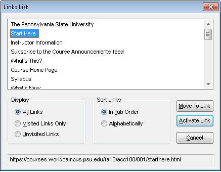
Figure x.
Links
Title Attribute
(covered in HTML Section)
Name/Description (Context)
Links should give a title but the name of the link should also help convey the context of the link with regards to the materials that refers to or surrounds it. Screen readers can read links as a list of links on the page, disregarding the content that surrounds them. For this reason, the link’s name should help give a description or context to what the user will be linking to.
Link Colors
The colors of links across the web predominantly look the same way and unless something different is specified, browsers render them all in the same conventions. They have a specific blue color when they have not been visited and they turn a darker purple color once you have visited them. The links are also underlined for a non color visual representation. One argument I will not make here is that these colors are the best colors to use. There is however the argument that because it is the typical experience users encounter across the web, it is in effect the convention the user expects before ever visiting your page. Experience is a big part of usability and the best practices that should be used. The user should have information presented to them as they would expect to receive it, unless there was a compelling reason to change an element.
One example of a compelling reason to use a different color, in spite of what a user would expect, could be in relation to other color elements on the page. If your background color is a similar blue as the color typically used for un-visited links, you would want to specify a color that has better contrast from both the background color and the text color you have chosen so that the link visibly stands out.
New/Pop-up Windows
Avoid links opening in a new window when it is not necessary. Opening links in a new window can become confusing for users of a screen reader, users with cognitive impairments such as ADHD, and users with small screen resolutions on devices like netbooks, Internet tablets, or smart phones.
If you need to use a new window, always identify that a link will be opening in a new window so that the user is aware of their placement once the new window opens. This is important because the new window will need to be closed to get back to the previous content rather than using the back or previous functions.
If JavaScript is being used to open content in a new window, linking back to content should be provided. This would be very important for the user if they did not understand that the link had opened content in a new window. This could happen if a sceen reader did not tell the user that a new window was opening, or if the user was not paying attention when the screen reader did mention it. It could also be helpful for user's who have JavaScript disabled and the content ends up opening in the same window. Typically when we open a link in a new window, we do not add navigation because we assume that the user will just close the window. In the case of having the JavaScript disabled, the link would open within the same window and the user would have no navigation from there. The back button could be used in this case, however, we should not rely on this possibility alone.
Another important element to pay attention to is any “close window” links or buttons. These should be rendered in the JavaScript itself. This way, the link would not be available if the user has the JavaScript disabled. If this was to be available when JavaScript is disabled the user would have opened the link in the same window, and could mistakenly use the "close window" link and exit the system entirely, causing them to need to reopen their browser and navigate back to where they left off.
In Line Links
Avoid making the text saying, “click here”, the actual link. “Click here” does not identify the link or describe the content of the page that you are linking to.
Rather than saying click here or hyper linking a word within the text, you should list a definitive link.
Example: Please read this article for next week’s class.
Imagine the word article in the last sentence being the link to the actual article. A screen reader will stop on the hyper-linked word to read additional hyperlink information, thus splitting the sentence or a paragraph it is in and creating a cognitive barrier for users of a screen reader. It would be better to write the statement this way:
Please read the following article for next week’s class: (insert the link here with the link text being the title of the article.)
Buttons
A functional button with an image on it should have an alt tag with the name of the function in it. For example: Submit.
If button with word or image on it has text of intended function right next to it, it is OK to NOT give ALT tag to button (as long as clicking on text word next to it results in same function as clicking button).
Images used for navigation
Images used for navigation should include an alt attribute that clearly describes the link title/function and the content it will link to. Example would be an arrow pointing to the right that links to the next page. In this example, a suitable alt attribute would be simply “Next Page” and would not require a description of the content being linked to because it is to be assumed a continuation of the current content being viewed.