Main Content
Content Descriptions
- First Page
- Previous Page
- 1
- 2
- 3
- Next Page
- Last Page
Science, Technology, Engineering and Math (STEM) Diagrams
Many STEM images are best described by a linear, narrative description or "traditional" description. The guidelines to follow are to keep the descriptions brief, clear, focused on the data, and in a drill-down style organization.
Control
Users should have control over the navigation of the diagram descriptions. We want to use text descriptions rather than audio descriptions because the user has better navigation control with text when using a reader. You want to be sure to properly format the HTML, especially with lists, and tables.
Brevity and Clarity
Make descriptions as brief as possible without leaving out any key concepts or information. It takes people with visual impairments more time to read books and articles than people without visual impairments and the process should not be further slowed down by unnecessarily long image descriptions. Likewise, the descriptions should not be more complicated than necessary and should be presented in a way that it easy to follow.
Example 1:

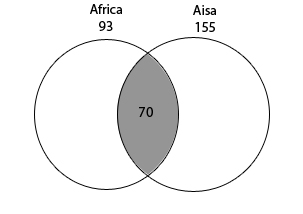
In a survey of 250 European travelers, 93 have traveled to Africa, 155 have traveled to Asia, and 70 have traveled to both of these continents, as illustrated in the Venn diagram above.
PREVIOUS Method: The figure is a Venn diagram and shows 2 intersecting circles inside a large rectangle. The circle on the left is labeled Africa and the number 93 is under Africa and above the circle. The circle on the right is labeled Asia and the number 155 is under Asia and above the circle. The intersection of the two circles is shaded and has the number70 in the shaded region.
PREFERRED Method: The Venn diagram shows 2 intersecting circles, one labeled Africa 93 and the other labeled Asia 155. The area of intersection is labeled 70.
Data
Complex Diagrams
The descriptions should focus on the data and not extraneous visual elements. Elaborately illustrated diagrams often contain key data that can be made accessible by presenting the data separate from description of the overall image.
Example 2:

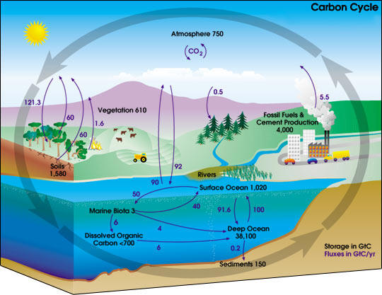
PREVIOUS Method: In a diagram titled "Carbon Cycle" numbers and arrows illustrate the movement of carbon through Earth's atmosphere, land, ocean, and interior. Black numbers indicate amounts of stored carbon. Purple numbers and arrows indicate annual fluxes in carbon. Amounts are measured in GtC - giga tons of carbon. Colorful pictures depict a sunny landscape with elements of the carbon cycle. Four long arrows encircle the landscape, representing the cycling of carbon.
Carbon is stored in many places: 750 GtC in the atmosphere; 610 GtC in vegetation; 4,000 GtC in fossil fuels and cement production; 1,580 GtC in soils; 3 GtC underwater in marine biota; less than 700 GtC in dissolved organic carbon underwater; 150 GtC in soil sediments beneath the water; 38,100 GtC in the deep ocean; and 1,020 in the surface ocean.
On Land, many factors cause annual fluxes of carbon in the atmosphere. An arrow points away from a factory's smoke chimney, illustrating how fossil fuels and cement production release 5.5 GtC into the atmosphere. On the other side of a river, an arrow points to a grove of pine trees, illustrating the trees absorption of 0.5 GtC from the atmosphere.
...
PREFERRED Method:
A diagram titled Carbon Cycle
Colorful pictures depict farms, forests, rivers, oceans, and industry. Four long arrows encircle the diagram, representing the cycle of carbon. Smaller arrows illustrate Storage of Carbon and Fluxes in Carbon through Earth's atmosphere, oceans and land. Amounts are measured in GtC - giga tons of carbon.
Carbon Storage and Annual Fluxes in Carbon are depicted in the following tables.
| Storage Area | GtC |
|---|---|
| Atmosphere | 750 |
| Vegetation | 610 |
| Fossil Fuels and Cement Production | 4,000 |
| Soils | 1,480 |
| Surface Ocean | 1,020 |
| Deep Ocean | 38,100 |
| Marine Biota | 3 |
| Underwater Dissolved Organic Carbon | less than 700 |
| Ocean Sediments | 150 |
| Flux | GtC |
|---|---|
| Atmosphere to Vegetation | 121.3 |
| Vegetation to Atmosphere | 60 |
| Soils to Atmosphere | 60 |
| Forest Fires to Atmospheres | 1.6 |
| Atmospheres to Evergreen Forest | .5 |
| Fossil Fuels and Cement Production to Atmosphere | 5.5 |
Pie Charts
For Pie Charts, a good method is to use a drill-down technique. You should give a brief summary followed by an extended description and specific data. Give any specific information in list or table format. A list format can be used for a pie chart giving just a label and a single value such as percent. If there is more than one value such as percent and a dollar amount associated with a single label, it is a better idea to use a table. Regardless of using a list or table format, the data should be listed in the order of the largest piece to the smallest.
Example 3:

Description:
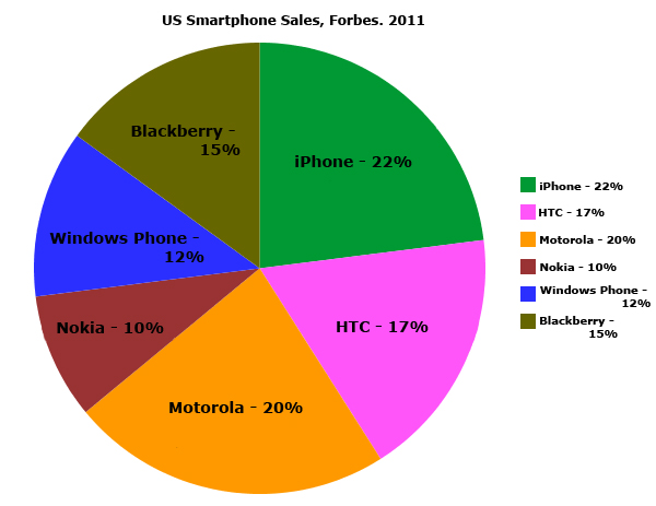
The figure is a pie chart.
Title: US Smartphone Sales: Forbes, 2011.
- iPhone 22%
- Motorola 20%
- HTC 17%
- Blackberry 15%
- Windows Phone 12%
- Nokia 10%
Tables
Simply recreate the table in properly formatted HTML with a brief summary or overview.
Processes
Process diagrams are very different than data diagrams in their purpose. Processes that are presented visually can be converted into nested lists with good results. Some different types of STEM process images that work well in a list form include flow charts, diagrams, illustrated chemical reactions and more.
Example 4:

Description:
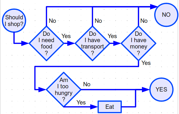
The figure is a flow chart to come to a decision on if you should go grocery shopping. It starts with the question to go shopping and goes through conditional questions to arrive at a conclusion.
Here the flow chart is described as a series of lists in which possible choices are listed below each stage of the decision process and where those choices will transition you to.
-
Should I shop?
- Transition to Do I need food?
-
Do I need food?
- No. Transition to No
- Yes. Transition to Do I have transport?.
-
Do I have transport?
- No. Transition to No.
- Yes. Transition to Do I have money?.
-
Do I have money?
- No. Transition to No
- Yes. Transition to Am I too hungry?.
-
Am I too hungry?
- No. Transition to Yes.
- Yes. Transition to Eat
-
No
- End of Decision, answer to go shopping is no.
-
Eat
- Transition to Yes.
-
Yes
- End of Decision, answer to go shopping is yes.
- First Page
- Previous Page
- 1
- 2
- 3
- Next Page
- Last Page
