
MBADM813:
Lesson 1: Decision Making Under Uncertainty
Lesson 1 Overview
In this introductory session, we will discuss the need for data-driven decision-making in businesses. Because of the digital revolution, businesses now have massive amounts of data: sales, operations, customer profiles, market conditions, environmental factors, consumer sentiments—you name it. Most of this data is generated as a byproduct of an organization’s everyday workflow. For example, employees generate data about their entry and exit times by scanning their badges at work; we all generate volumes of data about our browsing habits—the sites we visit, how much time we spend there, in what order we stream, and so on. A digital footprint of a patient is created every time they visit a physician, go for a laboratory procedure, order a prescription, pay for a visit, and so on.
As much data as we may have, decisions about the future must be taken under varying levels of uncertainty. The success of a new product launch may depend significantly on the economy, a newly discovered drug may have severe side effects, and a supplier may miss the shipment deadline due to a natural calamity, thus jeopardizing the production schedule. Statistics enable managers to make decisions and judgments based on past data and observations. Although we will never be able to perfectly predict the future, statistical methods should help us assess the likelihood of something happening. For example, how confident are we that our product will be successful? How likely is it that the drug may have unintended consequences?
With this in mind, our first task will be to make simple summaries of data. We will analyze whether or not the data has a lot of variability in it (variance and standard deviation), and what the average data point reveals about the nature of the data (mean and median). We will discuss the takeaways from these analyses for decision-making.
Learning Objectives
After completing this lesson, you should be able to
- identify the different types of variables to capture aspects of business and everyday life;
- describe a set of data using measures of centrality and position;
- analyze the degree of variability in a dataset using measures like variance and standard deviation; and
- construct tables and charts to visualize a dataset.
To review how the content, activities, and assessments align with one another and the course objectives, please visit the Course Map.
Lesson Readings and Activities
By the end of this lesson, make sure you have completed the readings and activities found in the Course Schedule.
Why Statistics?
Adapted from Five Guidelines for Using Statistics, 2006.
Are defects declining? Is customer satisfaction rising? Did the training seminar work? Is production meeting warranty standards? You inspect the numbers but you are not sure whether or not to believe them. It isn't that you fear fraud or manipulation; it's that you don't know how much faith to put in the statistics.
You are right to be cautious. "The actual statistical calculation represents only 5% of the manager's work," declared Harvard Business Professor Frances Frie. "The other 95% should be spent determining the right calculations and interpreting the results." Here are some guidelines for effective use of statistics.
Know what you know and what you are only asserting
In real life, managers do not do as much number-crunching as they think. Managers are primarily idea crunchers: they persuade people with their assertions. However, they often do not realize the extent to which their assertions rest on unproven assumptions. Victor McGee of Dartmouth College recommends color coding your "knowledge" so you know what needs to be tested. Red can represent your assumptions, yellow is what you "know" because of what you assume, and green is what you know. Assumptions and assertions (red and yellow knowledge) shouldn't be taken seriously and promote action unless data supports the action (green knowledge).
Be clear about what you want to discover
Some management reports rely heavily on the arithmetic mean or average of a group of numbers. But look at Figure 1.1, a bar graph analyzing customer satisfaction survey results on a scale of 1 to 5. For this data set, the mean is 4. If that's all you saw, you might figure people are satisfied. But as the figure shows, no one gave your product a rating of 4: instead, the responses cluster around a group of very satisfied customers, who scored it a 5, and moderately satisfied customers, who gave it a 3. Only by deciding that you wanted to look for subgroups within the customer base could you have known that the mean would not be the most helpful metric. Always ask the direct question, "What do you want to know?"

Don't take cause and effect for granted
Management is all about finding the levers that will affect performance. If we do such and such, then such and such will happen. But this is the world of red and yellow knowledge. Hypotheses depend on assumptions made about causes, and the only way to have confidence in the hypothetical course of action is to prove that the assumed causal connections do indeed hold.
Suppose you are trying to make a case for investing more heavily in sales training, and you have numbers to show that sales revenues increase with training dollars. Have you established a cause-and-effect relationship? No. All you have is a correlation. To establish genuine causation, you need to ask yourself three questions. Is there an association between the two variables? Is the time sequence accurate? Is there any other explanation that could account for the correlation?
It can be wise to look at the raw data, not just the apparent correlation. Figure 1.2 shows a scatter diagram plotting all the individual data points (or observations) derived from the study of the influence of training on company performance. Line A, the "line of best fit" that comes as close as possible to connecting all the individual data points, has a gentle upward slope. But if you remove Point Z from the data set, the line of best fit becomes Line B, with a slope nearly twice as steep as Line A. If removing a single data point (or in some instances a small proportion of the data points) causes the slope of the line to change significantly, you know this point (or points) is unduly influencing the results. Depending on the question you are asking, you should consider removing it from the analysis.
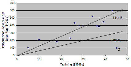
on Company Performance
For the second question—Is the time sequence accurate?—the problem is establishing which variable in the correlation occurs first. The hypothesis is that training precedes performance, but one must check the data carefully to make sure the reverse isn't true; that it is the improving revenue that drives the increase in training dollars.
Question 3—Can you rule out other plausible explanations for the correlation?—is the most time-consuming. Is there some hidden variable at work? For example, are you hiring more qualified salespeople and is that why performance has improved? Have you made any changes to the incentive system? Only by eliminating other factors can you establish the link between training and performance with any conviction.
With statistics, you can't prove things with 100% certainty
Only when you have recorded all the impressions of all the customers who have had an experience with a particular product can you establish certainty about customer satisfaction. But that would cost too much time and money, so you take random samples instead. A random sample means that every member of the customer base is equally likely to be chosen. Using non-random samples is the number one mistake businesses make when sampling. All sampling relies on the normal distribution and central limit theorem. These principles enable you to calculate a confidence interval for an entire population based on sample data. Suppose you come up with a defect rate of 2.8%. Depending on the sample size and other factors, you may be able to say that you are 95% confident that the actual defect rate is between 2.5% and 3.1%. Incidentally, as you get better and have fewer defects, you will need a larger sample to establish a 95% confidence interval. A situation of few defects requires that you spend more, not less, on quality assurance sampling.
A result that is numerically or statistically significant may be managerially useless and vice versa
Take a customer satisfaction rating of 3.9. If you implemented a program to improve customer satisfaction, then conducted some polling several months later and found a new rating of 4.1, has your program been a success? Not necessarily. In this case, 4.1 may not be statistically different from 3.9 because it fell within the confidence level.
Because managers can be unaware of how confidence intervals work, they tend to over-celebrate and over-punish. For example, a vice president might believe the 4.1 rating indicates genuine improvement and award a bonus to the manager who launched the new customer satisfaction program. Six months later when the rating has dropped back to 3.9, he might fire the manager. In both instances, the decisions would have been based on statistically insignificant shifts in the data. However if new sampling produced a rating outside the confidence interval (e.g., 4.3), the executive could be confident that the program was having a positive effect.
Be clear about what you want to discover before you decide on the statistical tools. Make sure you have established genuine causation, not just correlation while remembering that statistics do not allow one to prove anything with complete certainty. Also, keep in mind that not all results are statistically significant or managerially useful. Although the perspectives offered here will not qualify you to be a high-powered statistical analyst, they will help you decide what to ask of analysts whose numbers you may rely on!
Reference
Five guidelines for using statistics. HBS Working Knowledge. (2006). Retrieved August 9, 2022, from https://hbswk.hbs.edu/archive/five-guidelines-for-using-statistics.
Statistics in Management
Listen to Dr. Deborah Viola, Vice President of Data Management and Analytics at Westchester Medical Center Health, talk about how statistics and data analysis play a role at her organizations and the skills required for today’s data-savvy managers.
Statistical Technology Introduction
Microsoft Excel

As managers, you all are already very familiar with Excel. This is a ubiquitous and quite powerful tool for everyday analysis. We can use this tool to quickly create charts, graphs, and even run basic statistical analysis. Excel has quite an extensive library of functions. Also, the Data Analysis Toolpak along with the PHSTAT plug-in (please refer to the course syllabus on how to purchase) will allow us to perform the many analyses we will learn in this course.
Despite the ubiquity and ease of use, Excel falls short in a few areas. It can’t handle very large sets of data, there was no concept of using variables and variable types (we will learn about these in Lesson 1), and it does not handle categorical data (e.g., gender, answers in a multiple-choice survey) well. You may refer to
Why you must stop reporting data in Excel and The risk of using spreadsheets for statistical analysis for more on this topic.
Excel Resources
- Goodwill Community Foundation's Excel 2016 Tutorial: The tutorial covers from basic to somewhat advanced.
- Microsoft Excel Video Tutorials
IBM SPSS

Originally termed Statistical Package for the Social Sciences (SPSS), SPSS was acquired by IBM in 2009 and is now termed as IBM SPSS Statistics. This is a widely-used statistical tool used in social sciences as well as in marketing, healthcare, government, and other fields. The main advantages of SPSS over Excel (or any typical spreadsheet) are:
- The concept of cases and variables is built into it: On its surface, SPSS looks a lot like a typical spreadsheet application. The rows in SPSS represent cases (e.g., survey respondents); and the columns represent variables observed from those cases (e.g., salary, age of the respondents). Because of this case/variable arrangement, it makes calculations easy by using the variable name (e.g., select only the respondents whose age < 30). This is particularly advantageous when dealing with large sets of data.
- Various statistical tests (ANOVA, chi-square test, regression) are easily available with much more rigorous options: Instead of having to select an entire range of data in Excel (this becomes particularly cumbersome with large data sets), you choose the variable name in SPSS and mention the test you want to perform. The output appears in a different window with all relevant information (as opposed to in a new cell in Excel). This is very useful, especially while handling large amounts of data as it keeps the raw data separate from any output.
- Easier coding of data: A lot of today’s data, especially survey data, is numerically coded. For example, a response of “strongly agree” might become a 6; a level of education such as “completed high school” or “some college” might become a 1 or 2. SPSS makes it possible to automatically define the variable so that its coded values are keyed to their original meanings. As we will see later, this makes data analysis and making charts and graphs much simpler.
SPSS Resources
- SPSS beginner’s tutorial from SPSS Tutorials.com
- SPSS tutorial from Statistics How To
Basic Concepts in Statistics
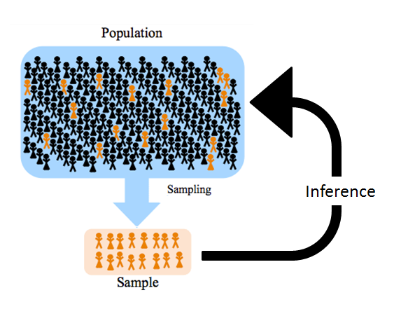
Let's now start with the fundamentals of statistics. The foundation of all statistical analysis is the concept of population and sample.
Populations and Samples
For any study of statistics, we must first define some common terms. Statistics are measurements of some kind of variables taken from samples. Those samples are drawn from a given population. Let's define the population and sample.
Population
A population is the group of all items of interest to a statistics practitioner. A population is frequently very large, sometimes infinite. For example, the Census Bureau estimated that there were 245.5 million Americans ages 18 and older in November 2016, so the population of eligible U.S. voters is 245.5 million (Pew Research Center FactTank, 2018). Similarly, all customers or all employees of a company can be considered as the population representing the customers and employees of that company, respectively. Measures used to describe the population are called parameters.-
Figure 1.4. Population
- Parameter
- A parameter is a descriptive measure of a population.
Examples of population parameters:
- Facebook wants to estimate the average amount of time women spend on the site each day (population parameter).
- Macy’s wants to estimate the average amount a customer spends in its stores during the summer weekends (population parameter).
Sample
A sample is a subset of the population. A sample is potentially very large, but less than the population. For example, samples of a few hundred voters from an exit poll on election day throughout the country. A measure computed from sample data is called a statistic.-

Figure 1.5. Sample
- Statistic
- A statistic is a descriptive measure of a sample.
Examples of sample statistics:
- From a random sample of 50 female Facebook users, the company obtained a sample average of 30 minutes/day (sample statistic).
- A random sample of 250 customers was taken from different parts of the country during the Saturdays and Sundays of July and August. The average customer spent $300 (sample statistic).
Types of Statistics
There are two basic classifications of statistics, descriptive and inferential. Both play an integral role in the analysis of a dataset. This course will explore the basics of each one.
Descriptive Statistics
Descriptive statistics deal with the collection, summarization, and description of data. They tell us information such as:
-
- How were the sales of a new product?
- How much time do people spend on social media?
- What does it cost to ship our products to customers?
Descriptive statistics provide a concise summary of data. They can be represented graphically or numerically.
Inferential Statistics
In the previous examples, what can we say about the time women spend on Facebook each day? What can Macy's say about its customers' spending habits during the summer months? Does this properly reflect a typical woman on Facebook or a typical customer at Macy’s?
This inference helps us in decision-making down the line. Facebook can use the information about women’s browsing times to place ads that are targeted to women. Macy’s can use its summer weekend sales data to create sales targets for store managers.
What can we infer about a population's parameters based on a sample's statistics?
Statistical inference is the process of making an estimate, prediction, or decision about a population based on a sample. Inferential statistics can be categorized in two major areas: estimation and statistical testing.-
-
Estimation
-
Estimation deals with prediction. We predict the average, median, or other characteristics of the data based on past observations.
Estimation Example: What will be the average sale of the new iPhone based on past history? -
Statistical Testing
-
Testing allows us to statistically test our beliefs or conjectures about a set of data.
Testing Example: Women are more likely than men to click on an advertisement on social media.
Caution!
Statistics can easily mislead you if you do not know what to watch out for.
“There are three kinds of lies: lies, damned lies, and statistics. -Origin not known, some (probably erroneously) attributed to Mark Twain
Small Sample Size
We know that we take a subset of the population to make inferences about the population. The number of data points in the subset is known as the sample size. The bigger the sample size, the better. A study performed with a small number of observations may not provide statistically valid results (more about this in Lesson 3).
For example, take whole-body cryotherapy. This is an extreme cold treatment that is said to provide several health benefits. A 2015 Cochrane systematic review looked at studies assessing the benefits and harms of whole-body cryotherapy in preventing and treating exercise-induced muscle soreness in adults and found that the claims are based on four studies of an extremely small sample size: 64 young adults (average age of 23), 60 of whom were male. Such a small sample size brings to question the validity of the treatment’s claims. 64 young adults with an average age of 23 are not the intended population if the treatment is marketed to men and women of all ages.
Biased Sample
A biased sample, on the other hand, involves only certain parts of the population in the study and thus does not properly represent the population. Take, for example, clinical trials on cardiovascular diseases.
Cardiovascular disease is the number one killer of U.S. women, and it affects men and women differently at every level, including symptoms, risk factors and outcomes. But only one third of cardiovascular clinical trial subjects are female and only 31% of cardiovascular clinical trials that include women report results by sex. (Westervelt, 2015)
No wonder medicine often has dangerous side effects for women, and we are realizing this now!
References
McGregor, A. (2014). Why medicine often has dangerous side effects for women. TED. Retrieved from https://www.ted.com/talks/alyson_mcgregor_why_medicine_often_has_dangerous_side_effects_for_women
Westervelt, A. (2015). The medical research gender gap: How excluding women from clinical trials is hurting our health. The Guardian. Retrieved from https://www.theguardian.com/lifeandstyle/2015/apr/30/fda-clinical-trials-gender-gap-epa-nih-institute-of-medicine-cardiovascular-disease
Types of Variables
Data (at least for the purposes of statistics) fall into two main groups: categorical and quantitative.
-
Variable
- A variable is a characteristic of the chosen sample that needs to be analyzed for decision-making. For example: age, gender, household income, number of children, average sale, time spent on social media,
Classifying Variables
-
Quantitative
-
Numerical values with magnitudes that can be placed in meaningful order with consistent intervals, also known as numerical or measurement variables.
- Discrete
- Numerical data that can be counted:
- age
- number of production plants
- number of employees
- Continuous
- Numerical data that is a continuous measurement:
- salary ($ usually considered continuous)
- experience (may also be considered discrete; depends on precision in measurement)
-
Categorical
-
Names or labels (i.e., categories) with no logical order or with a logical order but inconsistent differences between groups, also known as qualitative.
- For example, responses to questions about marital status, coded as: Single = 1, Married = 2, Divorced = 3, Widowed = 4
- Nominal Data
- Nominal data are qualitative responses coded in numbers.
Arithmetic operations don’t make any sense (e.g., does Widowed ÷ 2 = Married?).
- Ordinal Data
-
Ordinal data appear to be categorical in nature, but their values have an order or ranking.
- For example, Amazon reviews: Poor = 1, Fair = 2, Good = 3, Very Good = 4, Excellent = 5
- Although it is still not meaningful to do arithmetic on this data (e.g., does 2*fair = very good?!), we can say things like excellent > poor or fair < very good. That is, order is maintained no matter which numeric values are assigned to each category.
Choice of Variables
One important aspect of statistical analysis is identifying variables that may be relevant to your study and collecting data about them. In the end, not all the variables you identified may be relevant. But you should start by exploring all of them (within financial, time, and resource constraints) and then choose the most important ones. For example, what are the variables that determine salary? Probably education level, years of experience, age, and maybe gender. After our analysis, we may discover that gender does not have any effect on salary, but it is important to include this in our initial analysis if only to test whether it affects our variable of interest (salary in this case). More on this later in Regression Analysis.
Classification Issues
The types of data do not always readily indicate how information should be classified. For example, is employee number numerical or categorical? Although this number may appear to be numerical, the intent of the variable can be categorical if the focus of the analysis is size of the firm. Other variables may cause classification problems. Suppose each employee’s file contains a performance evaluation in the form of a number that could range from 0 to 100. No employee has received an evaluation of 0, or even less than 40. Is this numerical data? Is an evaluation of 80 truly twice as good as an evaluation of 40? Maybe, maybe not—it depends on the scale used in the evaluation instrument. Is this ratio data? If so, what does 0 mean?
Practical Concerns About Interpreting Data Types
The purpose of introducing you to the forms of data types is to alert you to the distinctions that are natural and possible in the way data may appear. Although the classification of data may not always be clear, it is important to reflect on the available data and what it measures. Why? Although we know that it makes no sense to find the average of categorical data, you will undoubtedly see someone do it. It's easy to assign numbers to categorical data and then start adding and dividing, but this is no justification for doing so. For example, MBA programs often ask students for current salary information. When they do so, they often use surveys with salary groupings—categorical data. Then they will report a salary average for students—oops, this is meaningless! If we accept what is presented unquestioningly, we become part of the problem. Inappropriate use of data undermines the opportunity to see the information data can provide. We must always ask questions about data type to determine the meaningfulness of any data analysis.
Types of Studies
Data is collected in a variety of ways. Research studies are classified in terms of their designs. The two main types of studies are observational and experiments. Later in the course, you will find out more specifics about experiments and experimental design.
Observational Studies
-
Observational Study
-
In an observational study, the researcher collects the data without any sort of interventions or treatments applied to any of the subjects in the study. Observational studies are typically used to find associations between variables.
Collecting data on the number of hours worked by an employee and their production over the past three months- Surveys
- Surveys are a common type of observational study where a sample of the population is questioned about a set of topics.
Sending out a customer satisfaction survey to determine ways to improve your product
Experiments
- Experiments
-
In experiments, the researcher intervenes in some way to apply treatments to one or more of the groups in the study. An experiment is often used to establish causal relationships between variables.
One group of employees is given a new incentive plan while another group is not and productivity is measured for a specified amount of time to see if the incentives affect productivity.
Descriptive Statistics
In this lesson, we will focus mostly on descriptive statistics (i.e., describing data and creating graphs and charts). We will be learning the basic descriptive statistics concepts using data from a production facility described below.
Case I: Production Line
This is data from a production facility where five parallel lines are filling boxes of cereal. The target weight of each box is 25 oz Each production line weighs a box every 30 seconds. You are the shift manager in this facility. Your job is to randomly check the weights of the boxes from each line. If you notice an anomaly (e.g., over- or under-filled boxes), you can stop the line to make an inspection. If the boxes are approximately 25 oz, you let the line continue.
SPSS Data File
Measures of Center
Most sets of data tend to group or cluster around a center point. Measures of central tendency yield information about this area of most common occurrences. In short, they tell us about what is a typical outcome. The three most common measures of center are the mean, median, and mode.
Mean
-
The numerical average is calculated as the sum of all of the data values divided by the number of values.
Example: Last Five Weights, Line 1
Find the mean of the last five weights of Line 1.
Table 1.1. Mean: Last Five Weights, Line 1 Time (minutes) Line 1 Weight (oz) 544.0 24.85 544.5 25.04 545.0 24.68 545.5 24.83 546.0 24.82 Median
- To find the median, sort the numbers from smallest to largest.
- If odd number of numbers, the middle number in the median
- If even number of numbers, then the average of the two middle numbers
Example: Last Five Weights, Line One
Order the numbers from least to greatest.
24.68, 24.82, 24.83, 24.85, 25.04
Median = 24.83
Mean vs Median
While the mean (i.e., the average) is the most frequently used measure, it may be misleading at times, especially if there are extreme data points. Consider the following example:
Warren Buffet moves to your street. What happens to the average household income of your neighborhood?
Person Street 1 Street 2 Table 1.3. Neighborhood Household Income 1 $10,000 $10,000 2 $20,000 $20,000 3 $30,000 $30,000 4 $40,000 $40,000 5 $50,000 $50,000 6 $60,000 $60,000 7 $70,000 $1,000,000 Street 1
- Mean income: $40,000
- Median income: $40,000
Street 2
- Mean income: $173,000
- Median income: $40,000
If you are looking at just the mean, all of a sudden everybody is earning a lot more than they did before Mr. Buffet moved to your street! Looking at the median, tell the true story, though. Outliers are extreme values in your data point (such as Warren Buffet moving onto a regular street). The mean may be somewhat misleading in the presence of outliers. However, because the median partitions the data in two halves, it provides a truer picture in the presence of such extreme values.
Mode
- The value that occurs most often.
How useful is mode in this instance? Mode does not provide much information about the center of this data. When would mode be important? In the world of business, the concept of mode is often used in determining sizes. For example, shoe manufacturers might produce inexpensive shoes in three widths only: narrow, normal, and wide. Each size represents a modal width. By reducing the number of sizes, companies can reduce costs by limiting machine set-up costs. Similarly, the garment industry produces clothing products in modal sizes.
An interesting work related to mode occurred in the fast food industry where firms found that consumers typically bought regular drinks when offered regular and large sizes. The industry designed an experiment to test the effect of using regular, large, and supersize—the latter a size few would ever choose. The result was that consumers now choose large more often than regular.
Descriptive Statistics: SPSS Instructions
SPSS: Introduction
Descriptive Statistics: SPSS Instructions Handout
Measures of Position
Five-Number Summary
Exploratory data analysis often relies on what has come to be known as the "five-number summary." The five-number summary describes the data using values for the following:
- Minimum: The lowest data point.
- First quartile/25th percentile: 25% of the data falls below this point.
- Median: The midpoint. 50% of the data falls below this point.
- Third quartile/25th percentile: 75% of the data falls below this percentile.
- Maximum: The highest data point.
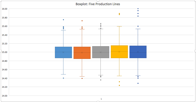
The five-number summary for each of the five production lines in our example is shown in the table below. Note that Line 5 has a high maximum compared to the other lines. We will investigate this in further detail later.
| Weight (Line 1) | Weight (Line 2) | Weight (Line 3) | Weight (Line 4) | Weight (Line 5) | |
| Minimum | 24.86 | 24.85 | 24.87 | 24.86 | 24.87 |
| 1st quartile | 24.86494136 | 24.84951363 | 24.86822835 | 24.86323203 | 24.8656515 |
| Median | 24.99956747 | 24.98879626 | 24.99455375 | 25.01186258 | 24.99256636 |
| 3rd quartile | 25.12359216 | 25.12290597 | 25.13664069 | 25.15478612 | 25.14793697 |
| Maximum | 25.74723625 | 25.72358749 | 25.65554908 | 25.89338591 | 27.6 |
The five-number summary goes hand-in-hand with boxplots (also sometimes known as the box-and-whisker plots). The figure below is a boxplot of the five production lines. The first thing to consider in this graph is the box. The ends of the box locate the 1st quartile and 3rd quartile. The line in the middle of the box is the median. As you examine the box portion of the box, you should notice whether the boxes on either side of the median are of the same height or not. If not, it would imply skewed data (e.g., the 5th production line seems to have a bigger difference between the 3rd quartile and the median compared to the others. The data points in the extreme ends are the outliers. Lines called "whiskers" extend from the box out to the lowest and highest observations that are not outliers.
Example: Employee Salaries
The five-number summary for 280 employee salaries at Mobile Inc. is (in thousands) 45, 50, 75, 82, 160.
- How many employees make 75,000 or below?
- How many employees make 50,000–82,000?
- What could explain the gap between the third quartile and the maximum?
- Since 75,000 is the median, 50% of all data lie below. So 140 employees make 75,000 or below.
- 50,000 and 82,000 are the 1st and 3rd quartiles so 50% of the data lie between the two. So 140 employees make 50,000-82,000.
- The large gap between the last two could be accounted for by a few high paid executives who push the max a lot higher than most of the other employees.
Five-Number Summary Boxplot: SPSS Instructions Handout (Please refer to the SPSS intro handout first, from the page: Descriptive Statistics: Excel and SPSS Instructions.)
Measures of Variability
Now we will discuss measures of variability (variance, standard deviation, and range) using the production line example we used before.
Variance
- Variance:
- Variance and its related measure, standard deviation, are arguably the most important statistics. Used to measure variability, they also play a vital role in almost all statistical inference procedures.
The formula for variance is given by: sum squared distance from mean, divide by one less than the number of numbers. - Population variance is denoted by...(Lowercase Greek letter “sigma” squared)
- Sample variance is denoted by...(Lowercase “S” squared)
Example: Last Five Weights, Line 1
| Time (minutes) | Line 1 weight (oz) |
|---|---|
| 544.0 | 24.85 |
| 544.5 | 25.04 |
| 545.0 | 24.68 |
| 545.5 | 24.83 |
| 546.0 | 24.82 |
Why take the squared difference from the mean?
So that positive and negative differences do not cancel each other out.
- Standard Deviation
- Square root of the variance
Population standard deviation:
Sample standard deviation:
Example: Last Five Weights, Line 1
| Time (minutes) | Line 1 weight (oz) |
|---|---|
| 544.0 | 24.85 |
| 544.5 | 25.04 |
| 545.0 | 24.68 |
| 545.5 | 24.83 |
| 546.0 | 24.82 |
Why take the square root?
Same unit as mean, more meaningful.
One of the simplest measures of spread is the range.
- Range
- the difference between the two extreme values. It is the measure of spread.
Range = Max - Min
Example: Last Five Weights, Line 1
Find the range for the last five weights from Line 1.
| Time (minutes) | Line 1 weight (oz) |
|---|---|
| 544.0 | 24.85 |
| 544.5 | 25.04 |
| 545.0 | 24.68 |
| 545.5 | 24.83 |
| 546.0 | 24.82 |
Range = 25.04 - 24.68 = 0.36
Comparing Standard Deviations
The standard deviation can offer insights into the data that you may not be able to get just through the measure of center. Take the following three data sets. Each set has the exact same mean. So, are the data the similar or the same? Not necessarily. The standard deviations for each set are different. The dot plot shows the great variation. While Set 2 is grouped around the mean, Set 3 has no data points close to the mean and a high standard deviation.
| Variable | Mean | StDev |
|---|---|---|
| Set 1 | 15.500 | 3.338 |
| Set 2 | 15.500 | 0.9258 |
| Set 3 | 15.500 | 4.567 |
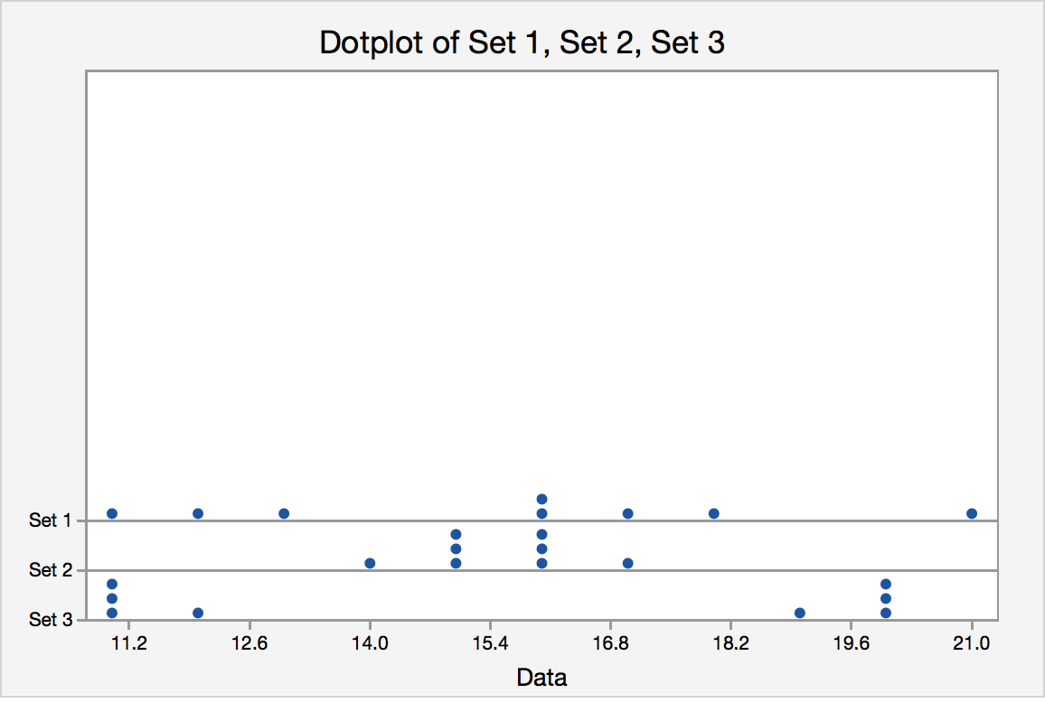
Figure 1.7. Standard Deviations in Different Datasets With the Same Mean
Coefficient of Variation
The coefficient of variation is a relative measure variation expressed as a percentage of mean. The coefficient of variation is given by the following formula:
- Coefficient of variation = standard deviation/mean
This is helpful if we are comparing different types of data (for example, does age or salary have a higher level of variability?) or datasets with varying means and standard deviation (e.g., do women's salaries show more variability than men's salaries?).
Graphical Summaries
Graphs and charts also provide effective tools for describing data; but they are only starting points. However, they are often good complements to descriptive statistics in presentations of data analysis.
Graphing One Quantitative Variable
Two of the most commonly used graphs for one quantitative variables are the histogram and box plot. We have already learned about box plots and will now create histograms.
- Histogram
-
The histogram is one of the most important and common graphs used to display quantitative variables. A histogram is essentially a bar graph for measurement data. In a histogram, the categories are a range of numbers. Usually, each numerical category must have the same width. The heights of the bars either reflect the frequency or the relative frequency (percent) of encountering that range of numbers in the data. To create histograms, we need to understand the concept of frequencies. We will illustrate this using the following case.
Case II: Monthly Telephone Bills
Google’s Project Fi is a new wireless phone service that seamlessly switches a customer’s phone between a handful of networks—Sprint, T-Mobile, and U.S. Cellular—to get the best possible signal at any given time. It also taps into reliable public Wi-Fi networks (with its own layer of encryption in place) and uses those for calls and data whenever it can.
The marketing manager at Google wants to acquire information about the monthly bills of new subscribers in the first month after signing with the company. The company’s marketing manager surveyed 200 new subscribers wherein the first month’s bills were recorded. These data are stored in files FiMonthlyBills.xlsx (Excel) and FiMonthlyBills.sav (SPSS). The manager planned to present his findings to senior executives.
In this example, we create a frequency distribution by counting the number of observations that fall into a series of intervals, called classes.
We choose eight classes defined in such a way that each observation falls into one—and only one—class. These classes are defined as follows:
Classes
- amounts that are less than or equal to 15
- amounts that are more than 15 but less than or equal to 30
- amounts that are more than 30 but less than or equal to 45
- amounts that are more than 45 but less than or equal to 60
- amounts that are more than 60 but less than or equal to 75
- amounts that are more than 75 but less than or equal to 90
- amounts that are more than 90 but less than or equal to 105
- amounts that are more than 105 but less than or equal to 120
Frequency Distribution
- Frequency Distribution
- A frequency distribution is a tabular summary showing the frequency of observations in each of several non-overlapping (mutually exclusive) classes or cells. There can be different types of frequency distributions.
- (Observed) Frequency
- This is the actual number of occurrences in a cell.
- Relative Frequency
- This type of frequency distribution displays the fraction or proportion of observations that fall within a cell.
- Cumulative Frequency
- This type of frequency distribution displays the proportion or percentage of observations that fall below the upper limit of a cell.
So, the first task is to calculate the frequencies in each of our defined classes (0–$15, $15–$30, …). To do this, we will first create the histograms and then interpret the output.
Using Technology
Graphing a Histogram: SPSS Instructions Cumulative and Relative Frequencies: SPSS Instructions
In general, all of the graphs in SPSS can be found by going to Graphs > Chart Builder. From there, choose the appropriate graph for the given variable you want to summarize. View the Directions on Creating Charts in SPSS for specifics.
Relative and Cumulative Relative Frequencies
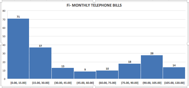
As we can see from our graphical output, 71 customer bills were in the range $0–$15, 37 customer bills were in the range $15–$30, and so on. These are the observed frequencies in each of the classes. We had a total of 200 customer data. So, the relative frequency of the spending class $0–$15 is 71/200 = 35.5%. The relative frequencies of each of the spending classes are shown in the figure below.
| Spending amount | Relative frequency |
|---|---|
| $0–$15 | 71/200 = 0.355 |
| >$15–$30 | 37/200 = 0.185 |
| >$30–$45 | 13/200 = 0.065 |
| >$45–$60 | 9/200 = 0.045 |
| >$60-$75 | 10/200 = 0.050 |
| >$75–$90 | 18/200 = 0.090 |
| >$90–$105 | 28/200 = 0.140 |
| >$105–$120 | 14/200 = 0.070 |
| Total | 200/200 = 1.0 |
The cumulative frequencies include the frequencies of all classes up to that point, as shown below.
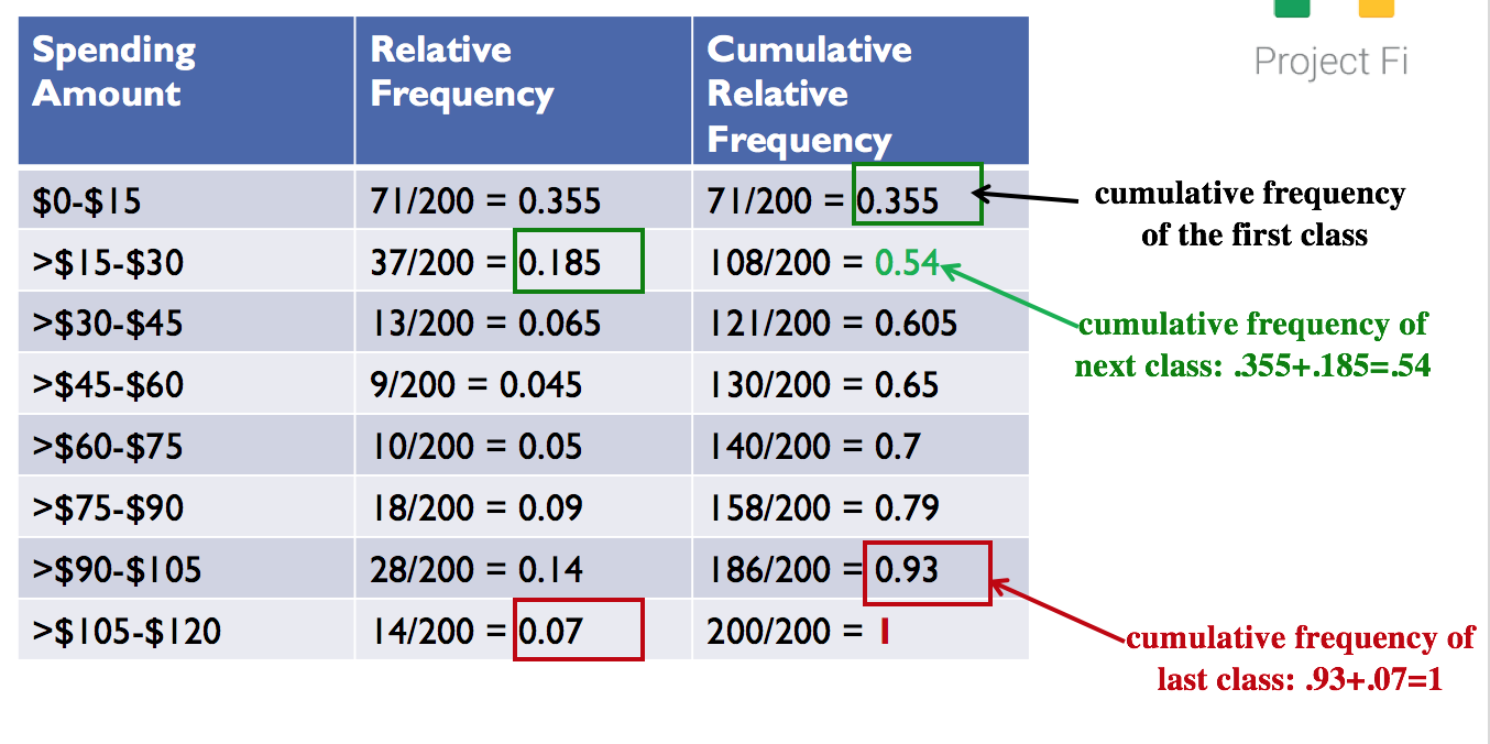
Figure 1.15. Cumulative Relative Frequencies
As we will see in Lesson 2, knowledge of histograms and frequency distributions forms the basis of understanding probability distributions.
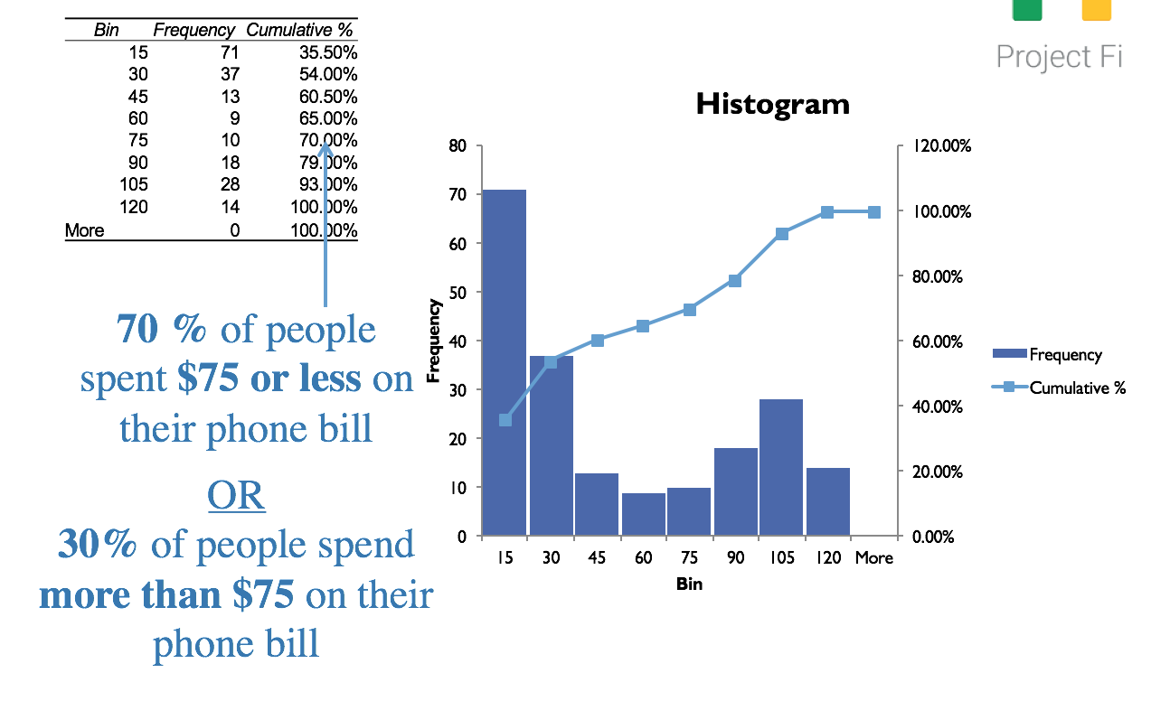
Figure 1.16. Interpreting Cumulative Relative Frequencies
You may refer to the FiMonthlyBills-Solution.xls file to see the formulas used in the example.
Lesson 1 Summary
- The choice of the right sample and sample size is the most important factor in statistical analysis. A manager should always ask about the sample size and sample characteristics. The sample must be a true representation of the population under question. Intentionally or unintentionally selecting only a subset of the population leads to less reliable results, and is often the reason people are skeptical about “statistical predictions.”
- Mean, median, and the mode are measures of centrality of the data. Few extreme data points (outliers) skew the data. The mean is sensitive to outliers, while the median is not.
- The 5-number summary of a data consists of the minimum, maximum, and median and the 25th and 75th percentiles.
- The 5-number summary can be graphically displayed with a box (also known as box-and-whisker) plots.
- Standard deviation measures how spread out the numbers are from the mean.
- Standard deviation may serve as a measure of uncertainty or risk.
- Quality control efforts are often aimed at reducing the standard deviation (i.e., increasing the predictability of a process).
- Which measure of variation to use?
- There are three main measures of variability—variance, standard deviation, and range.
- standard deviation is more often used over variance because it is directly interpretable. It has the same units as the data.
- range tells us the difference between the minimum and maximum data points, but does not tell much about how dispersed the data is.
- coefficient of variation is very useful (standard deviation/mean) when it comes to comparing disparate sets of data.
- There are three main measures of variability—variance, standard deviation, and range.
- Histograms and frequency distributions are common ways of visualizing the data.
- A histogram is a bar chart where the data is grouped in ranges.
- A frequency distribution shows the number of times a particular value occurs in the data.
- Relative frequency distributions show the percentage of times a particular value occurs in the data.