The Book as a Physical Object - Part II
E. End Papers
Just inside the cover are the end papers -- front and back. Often these are left a solid color, perhaps a hue that is appropriate to the story. For example, the front endpapers in Hey, Al, by Arthur Yorinks, Richard Egielski, are gray and the back endpapers are yellow, a metaphor for the change in Al's life. Other times illustrators might make an illustration specifically for the end papers. In John Patrick Norman McHennesy -- The Boy Who Was Always Late, our hero John is constantly late for school. His teacher punishes John by making him write the same sentence over and over, hundreds of times. The end papers show John's copy work and upon closer inspection you can see how John approached serving that punishment.
This is not a required book so make sure you take a moment to visualize the concept.
![]() Take a look at
the front and back end papers in your copy of When Sheep
Cannot Sleep. The front paper is pink and the back paper is a dark blue.
You might think about why Satoshi Kitamura chose to put different colored
papers
at the beginning and end of his book.
Take a look at
the front and back end papers in your copy of When Sheep
Cannot Sleep. The front paper is pink and the back paper is a dark blue.
You might think about why Satoshi Kitamura chose to put different colored
papers
at the beginning and end of his book.
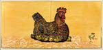
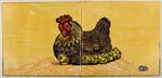
Sometimes the story may begin with the endpapers. Here the front and back endpapers for This Little Chick by John Lawrence. You can see that Lawrence begins his story with the front endpapers, showing the Little Chick leaving its nest to explore. The back endpapers show Little Chick back in the nest, sleeping.
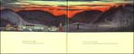
In other cases, such as Paul Zelinsky's Rumpelstiltskin, the end papers provide a panorama of the kingdom, including the castle, the mill, and the forest, providing a view of the the setting of the story. While you were not required to purchase this book, if you do happen have it available, take a look at the endpapers to see this. Otherwise, be sure to take a moment to visualize the concept.
F. Title Page
The Title Page is the page in the book where the title, the author/illustrator, and the publisher are printed. Sometimes these pages have unique illustrations, and sometimes the story begins with that illustration -- before any words to the story appear. For example, in John Lawrence's This Little Chick, the story Lawrence has begun on the end papers continues on the title page. The story is well on its way before we come to the first words of the story. You were not required to purchase this book; take a moment to visualize the concept.
G. Layout
Layout refers to the placement of the illustration and text on the page. In Ox-Cart Man, illustrator Barbara Cooney makes use of white space at the bottom of some illustrations as a metaphor for the journey theme of that story. She uses the upper half of the double-page spread for the illustration, leaving the bottom half white, where the text is placed. The effect is to make her picture very horizontal, which is suggestive of a trip or journey.
Snow White and the Seven Dwarfs, illustrated by Nancy Eckholm Burkett, alternates double-page spreads of words and picture. Fiona French works the words into the picture in Snow White in New York. Trina Schart Hyman uses windows of white inside her illustrations for the placement of the words in her version of Snow White. We deal more specifically with layout in the Elements of Design tutorial.
![]() Be sure you look at all three of your versions of Snow
White to see these concepts demonstrated.
Be sure you look at all three of your versions of Snow
White to see these concepts demonstrated.
H. Font / Typography
Font refers to the print face used to make the letters. As you know from any word processing program, there are hundreds, if not thousands, of fonts available for use. Illustrators in consultation with the art director of the publishing house and, perhaps the author, look for a font that evokes the mood they want to portray. The creators of Babushka and the Three Kings looked at hundreds of fonts until they found one that suggested Russian Cyrillic.
![]() Take
a look at your copy of The Stinky Cheese Man, where author Jon
Scieszka, illustrator Lane Smith, and designer Molly Leach poke fun at the
conventions
of picturebooks. Leach changes the font type and font size on nearly every
page, a move that wouldn't work for most picturebooks because artists usually
strive
for constancy in the look of the printed text. In The Stinky Cheese Man, the shifting look of the print works perfectly as a joke on the entire
genre of picturebooks.
Take
a look at your copy of The Stinky Cheese Man, where author Jon
Scieszka, illustrator Lane Smith, and designer Molly Leach poke fun at the
conventions
of picturebooks. Leach changes the font type and font size on nearly every
page, a move that wouldn't work for most picturebooks because artists usually
strive
for constancy in the look of the printed text. In The Stinky Cheese Man, the shifting look of the print works perfectly as a joke on the entire
genre of picturebooks.