Elements of Design - Part I
It is impossible to make a comprehensive list of all elements of design an artist can call upon to compose a picture. What follows is a brief discussion of five elements. If you want more information on design, you can check out Art and Illusion by Ernest Gombrich or Reading Images by Kress and van Leeuwen. (You can get more information about both books in the Library Reserves.)
A. Line Effects
Line is perhaps the most basic element of a picture. Because of this, we often take line for granted in our viewing of a picture. Yet line can convey the most basic of moods. Consider that horizontal lines suggest stability, vertical lines imply potential energy -- a resistance to gravity -- and diagonal lines suggest movement. Even the thickness and quality of the line can convey meaning. Compare the heavy, thick lines in When Sophie Gets Angry to the delicate lines of Allen Say's Kamishibai Man.
![]() Go to the Web Resources link for When Sophie Gets Angry to see images
and get more information.
Go to the Web Resources link for When Sophie Gets Angry to see images
and get more information.
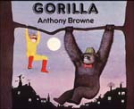
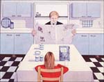
A precise, straight line suggests a clean, orderly and possibly sterile world, such as the illustration in Gorilla depicting Hannah eating her breakfast while her father reads the paper.
The lines in When Sheep Cannot Sleep are rougher and suggest informality. Artists can create a variety of effects using short lines. Sendak makes use of bracelet shading and cross-hatching to create shadow and volume in Where the Wild Things Are? Line can also suggest movement. Indeed, lines can have a character of their own -- we might call a line "bold," "nervous, " "hesitant," or "confident."
![]() What emotions do the lines in the illustrations of Snow
White in New York, When Sheep Cannot Sleep, and Where
the Wild Things Are suggest
to you? Be sure to look in your books to make the comparisons.
What emotions do the lines in the illustrations of Snow
White in New York, When Sheep Cannot Sleep, and Where
the Wild Things Are suggest
to you? Be sure to look in your books to make the comparisons.
B. Shape
When a line encloses space, it creates a shape. Shapes that are round tend to evoke peaceful feelings. Look at the shapes in Uri Shulevitz's Dawn. They are nicely rounded, even the border is rounded, and they look soft.
![]() Go to the Web Resources link for Dawn to see the cover image and get more
information.
Go to the Web Resources link for Dawn to see the cover image and get more
information.
![]() Shapes
with sharp edges and corners suggest tension and action. Look at the shapes
in
your copies of Uptown and Snow White in New York. Compare
those books to When Sheep Cannot Sleep. The images in When
Sheep Cannot Sleep are much more rounded and the edges are shaky, while
the shapes in the other two
books are much sharper in their edges and corners.
Shapes
with sharp edges and corners suggest tension and action. Look at the shapes
in
your copies of Uptown and Snow White in New York. Compare
those books to When Sheep Cannot Sleep. The images in When
Sheep Cannot Sleep are much more rounded and the edges are shaky, while
the shapes in the other two
books are much sharper in their edges and corners.
C. Color
Color is often the first quality of a picture we notice. Color has three elements, hue, saturation, and value.
Hue: Hue refers to the different colors of the light spectrum. We can think of them as simply "red" or "blue" or something more precise like "magenta" or "indigo." To the artist, hue refers to the pigment being used.
A word about black and white illustrations. Many photographers work only in black and white, because color can overwhelm the senses and can blot out other effects, especially the play of light and shadow and emotion and intention on the faces of characters. Look at the following images from Jumanji.

The absence of color allows the eye to look at other qualities of the picture. What emotions do you read on the face of the mouse? How do light and shadow work in The Middle Passage to convey the pain and injustice of the slave trade?
![]() Go to the Web Resources link for The Middle Passage to see images and
get
more
information.
Go to the Web Resources link for The Middle Passage to see images and
get
more
information.
Saturation: Saturation refers to the degree of purity in a hue. Highly saturated colors are bright, intense, and rich. Eric Carle's work is generally high saturated.
![]() Look at your copy of 1, 2, 3 to the Zoo to
see this demonstrated.
Look at your copy of 1, 2, 3 to the Zoo to
see this demonstrated.
Susan Guevara uses highly saturated hues in Chato and the Party Animals as does Molly Bang in When Sophie Gets Angry, Really, Really Angry. In the case of Molly Bang's book, the highly saturated colors can suggest the intensity of Sophie's feelings. In Chato and the Party Animals, Guevara is using a palate of highly saturated colors that are often found in the paintings of Hispanic artists. Be sure to look at your copy of Chato and the Party Animals to see this demonstrated.
![]() Go to the Web Resources link for When Sophie Gets Angry to see images
and get more information.
Go to the Web Resources link for When Sophie Gets Angry to see images
and get more information.
Value: Value or shade refers to the degree of darkness or lightness of a color, regardless of the hue. As black is mixed with a hue, we talk about the values being gray or muted. As white is mixed with a hue, effect is to brighten the picture. Because picturebooks are usually printed on white paper, the artist starts out with a bright tone. How the artist is able to work the white of the paper into the illustration often determines the kind of value or shade the picture has.
The contrasting of different values creates shadow. Compare the contrasts in Jumanji, which are extreme, with the contrasts in Shulevitz' s Snow, which are more uniform.
![]() Go to the Web Resources link for Snow to see images and get
more
information.
Go to the Web Resources link for Snow to see images and get
more
information.