Media of Picture Books - Part II
E. Collage & Construction
The word collage is derived from the French verb for "to paste." Collages are assemblages of different kinds, colors, and textures of paper, fabric, even modeling clay, leaves, feathers, stitchery; literally any material that an artist could use to make a picture.
Many prominent illustrators work in collage and/or paper construction, for example, Ezra Jack Keats, Leo Lionni, and Eric Carle. Typically the artist prepares the papers by painting them before cutting them into shapes. Eric Carle uses white tissue paper and then paints it, using wide brushes and highly saturated colors. Ezra Jack Keats would pour paint into a shallow pan of water, stir, and then lay white paper on the surface to pick up the paint. These papers became the backgrounds and sidewalks of his picture books. Some artists such as Ashley Bryan use commercially prepared tissue paper. Illustrators may also use other ready-made papers such as wallpaper, newspaper, or construction paper.
The collages of Keats and Carle are relatively flat. Until recently, all illustrations needed to be flat because the technology of reproduction required flat surfaces. Modern reproduction technology now allows artists to work in three dimensions, which often creates interesting textures. The late David Wisniewski was known for his detailed cut-paper sculptures. Using razor blades, Wisniewski made literally thousands of cuts to create intricate illustrations. Here is an example from his Caldecott winning book, The Golem.

Jeanne Baker in Where the Forest Meets the Sea creates collage assemblages out of a range of material: modeling clay, paper, leaves, hair, paint, feathers, and dried grass.
![]() Go to the Web Resources link for Where the Forest Meets the Sea to see images
and get more information.
Go to the Web Resources link for Where the Forest Meets the Sea to see images
and get more information.
Denise Fleming in Lunch makes her own paper out of cotton and other fibers, using pigment to color them. The result is a rough look.
![]() Go to the Web Resources link for Lunch to see images and get more information.
Go to the Web Resources link for Lunch to see images and get more information.
Stitchery and other kinds of fabric art are also media used by illustrators. Anna Grossnickle Hines used stitchery to create the illustrations for Pieces: A Year in Quilts.
![]() Go to the Web Resources link for Pieces: A Year in Poems and Quilts to see images and get more
information.
Go to the Web Resources link for Pieces: A Year in Poems and Quilts to see images and get more
information.
Faith Ringgold is well-known for her story-quilts, such as Tar Beach, which was originally gallery art and later turned into a picturebook.
![]() Go to the Web Resources link for Tar Beach to see images and get more
information.
Go to the Web Resources link for Tar Beach to see images and get more
information.
F. Computer-Generated
Because of advances in digital technology, many illustrators use computer graphics to smooth out their images after the images have been scanned or photographed digitally. Though it is still somewhat rare, some illustrators, such as J.otto use computer drawing programs to create the original art (Note: This is how he actually spells his name "J.otto." He's trying to make you think of Giotto, the late medieval painter). Siebolt used Adobe Illustrator software to create the illustrations for Mr. Lunch Borrows a Canoe.
![]() Go to the Web Resources link for Mr. Lunch Borrows a Canoe to see images
and get more information.
Go to the Web Resources link for Mr. Lunch Borrows a Canoe to see images
and get more information.
William Joyce worked on the Disney movie, Toy Story. From that experience in computer animation, he created a series of picturebooks and an animated television show based on the character, Rolie Polie Olie. One of them is Sleepy time Olie.
![]() Go to the Web Resources link for Sleepy Time Olie to see
images and get more information.
Go to the Web Resources link for Sleepy Time Olie to see
images and get more information.
G. Paints
Most children' s picturebooks are illustrated with paints, pen and ink, or some combination of these media. Paint can be thought of as being of two types: translucent or appearing to allow light to pass through it, and opaque, which seems impenetrable to light. Artists may apply paint thickly, or they may dilute the paint with water and paint using a series of "washes" or thinly applied paint, building up layers of color.
- Translucent -- water colors / washes
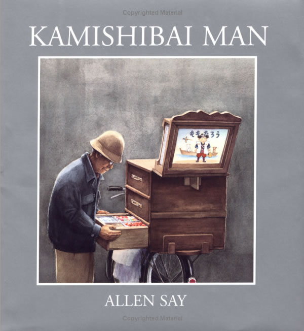
Watercolor is a transparent paint. The artist must work from the lightest hues to the darkest because the nature of the paint lets the dark paint show through any lighter colors painted on top of them. Though watercolor can produce dramatic pictures, we tend to associate watercolor illustration with gentle, quiet, and contemplative stories. Jerry Pinkney and Allan Say are two illustrators well known for their watercolor pictures. Look at this example from Allen Say's Kamishibai Man.
- Opaque
Opaque paints reflect light rather than give the impression of light passing through them. Opaque paints tend to give off a more brilliant and intense look than water color paints do. Tempura, Gouche, acrylic, and oil are all types of opaque paints. - Tempura
Tempura is a water-based paint, but is much denser than watercolor. Molly Bang' s When Sophie Gets Angry -- Really Really Angry is a good example of the intensity an artist can create with tempura.
Maurice Sendak used tempura to create the paintings for Where the Wild Things Are, then used pen-and-ink to create shading by crosshatching. Go to the Web Resources link for When Sophie Gets Angry to see images
and get more information.
Go to the Web Resources link for When Sophie Gets Angry to see images
and get more information.
 Be sure to look
in your copy of Where the Wild Things Are to see this demonstrated.
Be sure to look
in your copy of Where the Wild Things Are to see this demonstrated. - Gouache
Gouache is also a water-based paint, similar to watercolor but with chalk added to create the opaque effect. Like tempura, gouache tends to look vivid. In his books, Ashley Bryan often uses gouache in highly saturated colors to create his highly stylized, bright illustrations. Maira Kalman used gouache to create the illustrations for What Pete Ate.
Be sure to look
at your copy of What Pete Ate to see this demonstrated. - Acrylics
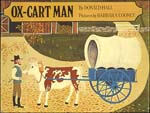
Acrylic paints are similar to oils, but are plastic-based and dry much more quickly than oil paint does. As with oils, the artist can build up a dense texture of paint. Barbara Cooney' s Ox Cart Man was done with acrylic paints.
Susan Guevara used acrylic paint on scratchboard to make the illustrations for Chato and the Party Animals.
Be sure to look
in your copy of Chato and the Party Animals to see this demonstrated.
- Oil
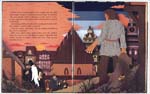
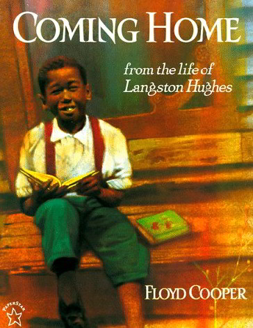
Illustrations made with oil paints tend to look rich and are marked by a detail that would nearly impossible with any other type of paint. It' s not a particularly common medium for picturebooks, probably because it takes so long to dry. Floyd Cooper uses a thin layer of oil paint on illustrator board, then takes a kneadable eraser to work back into the paint. By building up layers of color, Cooper creates a feeling of warmth and he often chooses warm stories to illustrate. Look at this image from Coming Home: From the Life of Langston Hughes.
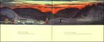
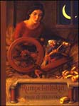
Paul Zelinsky used oil paint to illustrate three Brothers Grimm folk tales, Hansel and Gretel, Rumpelstiltskin, and Rapunzel. One of the effects Zelinsky wished to create was a sense of 17th century European painting. The detail is stunning, you can see the folds on clothing as it drapes on the wearer. Look below at the examples from Rumpelstiltskin.

H. Crayon
Crayon produces a soft and subtle effect. Leo Lionni used crayons to make the illustrations for Fish Is Fish.
![]() Go to the Web Resources link for Fish is Fish to
see images and get more information.
Go to the Web Resources link for Fish is Fish to
see images and get more information.